Office Entrance Interiors: Glass Doors and Sign Walls in 3 Designs
How much of the office should be visible at the entrance, and where should the company name go? Compare glass screening, inner walls and reception in the Namyangju 22 pyeong, Godeok Jisik Gongjakso 26 pyeong and Seongnam 34 pyeong tax accounting office designs.

Before you begin
- Compare views from the corridor and from just inside the door.
- Separate entrance information from the company sign on the interior wall.
- Define whether glass and frames stay, or walls and lighting will also be rebuilt.
Namyangju, 22 pyeong: a glass doorway and a separate sign wall
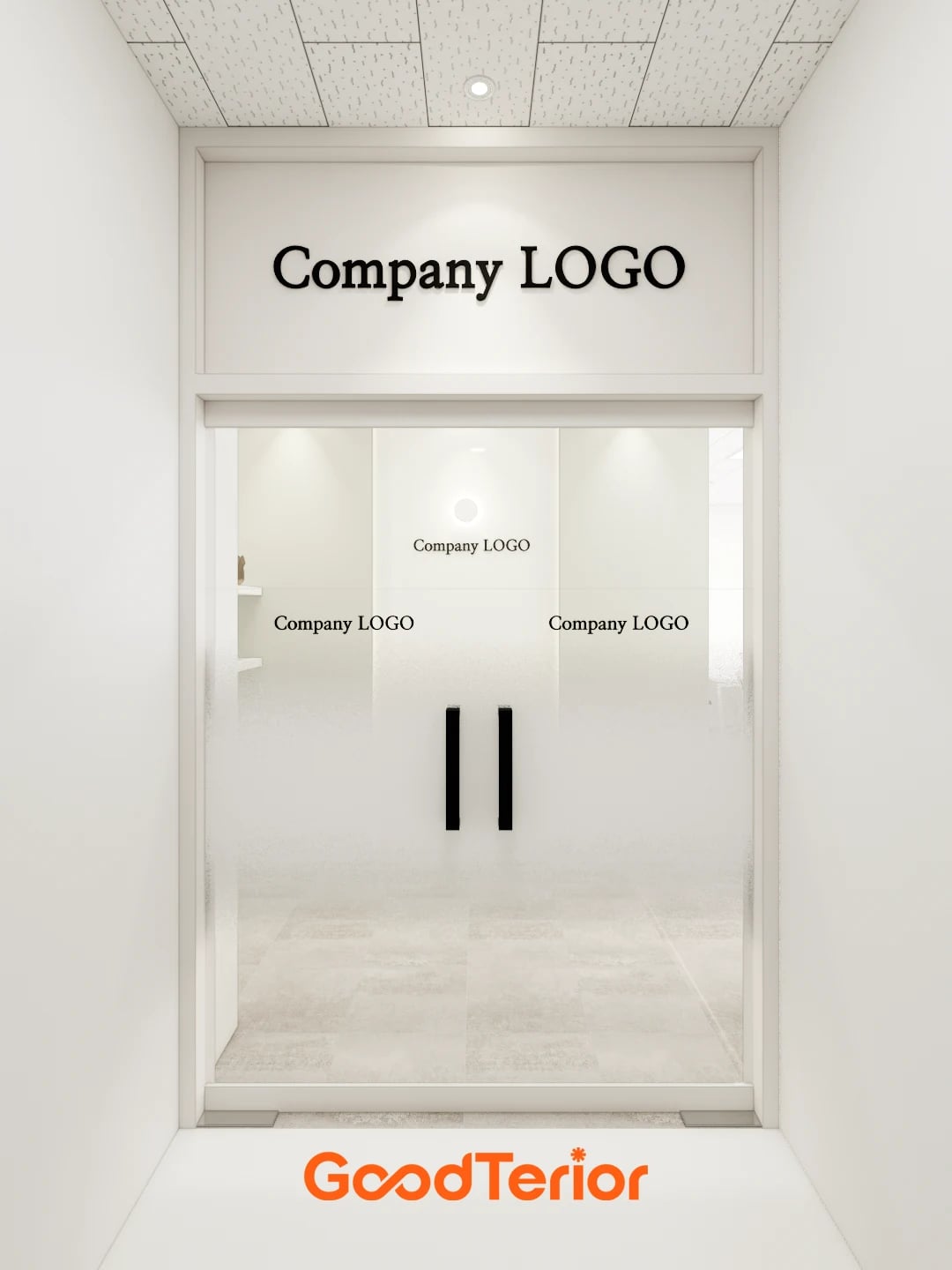
Office entrance interiors involve both finding a company from the corridor and receiving guidance once inside. The Goodterior Namyangju 22 pyeong office design lists 72.73㎡. All three examples in this article are design renders. Their stated areas describe the offices, rather than the entrances alone.
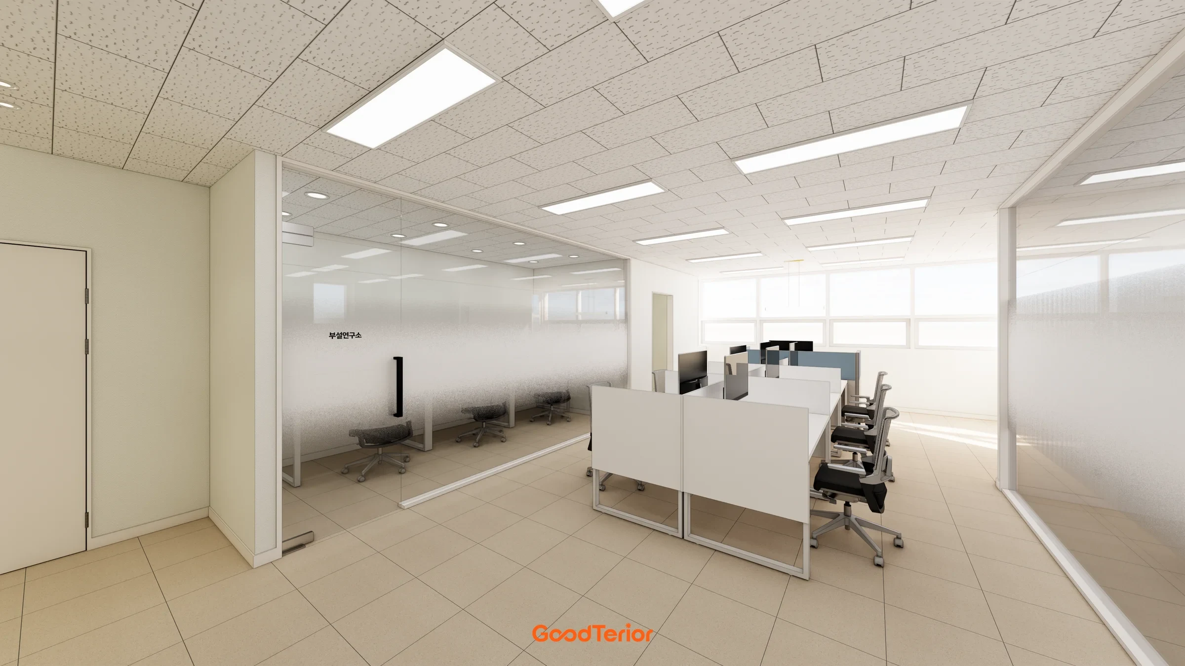
The selected Namyangju view shows a glass double doorway, long handles and screened areas. Company markings appear above the doorway and on the glass. If views of desks from the corridor are undesirable, compare replacing the glass with adding screening only where needed. The render does not establish the actual degree of screening or the glass specification.
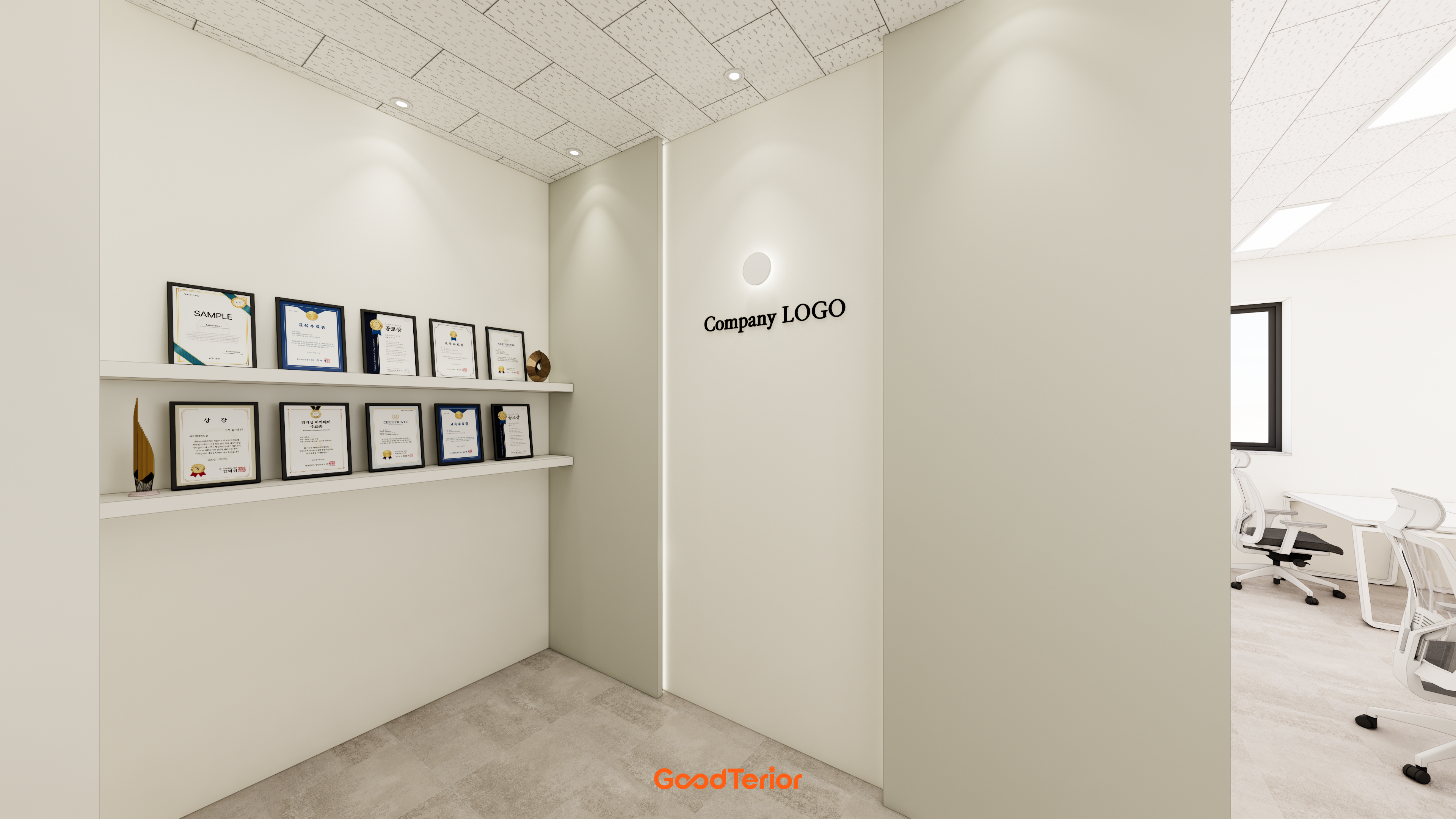
Inside, a wall bearing the company logo stands beside the work area. This can be read as a sequence of identifying the company outside and receiving guidance by an interior reference point. Before repeating text on both surfaces, assign the company name, visitor instructions and department information to appropriate positions. Check whether opening the door would obscure an interior sign.
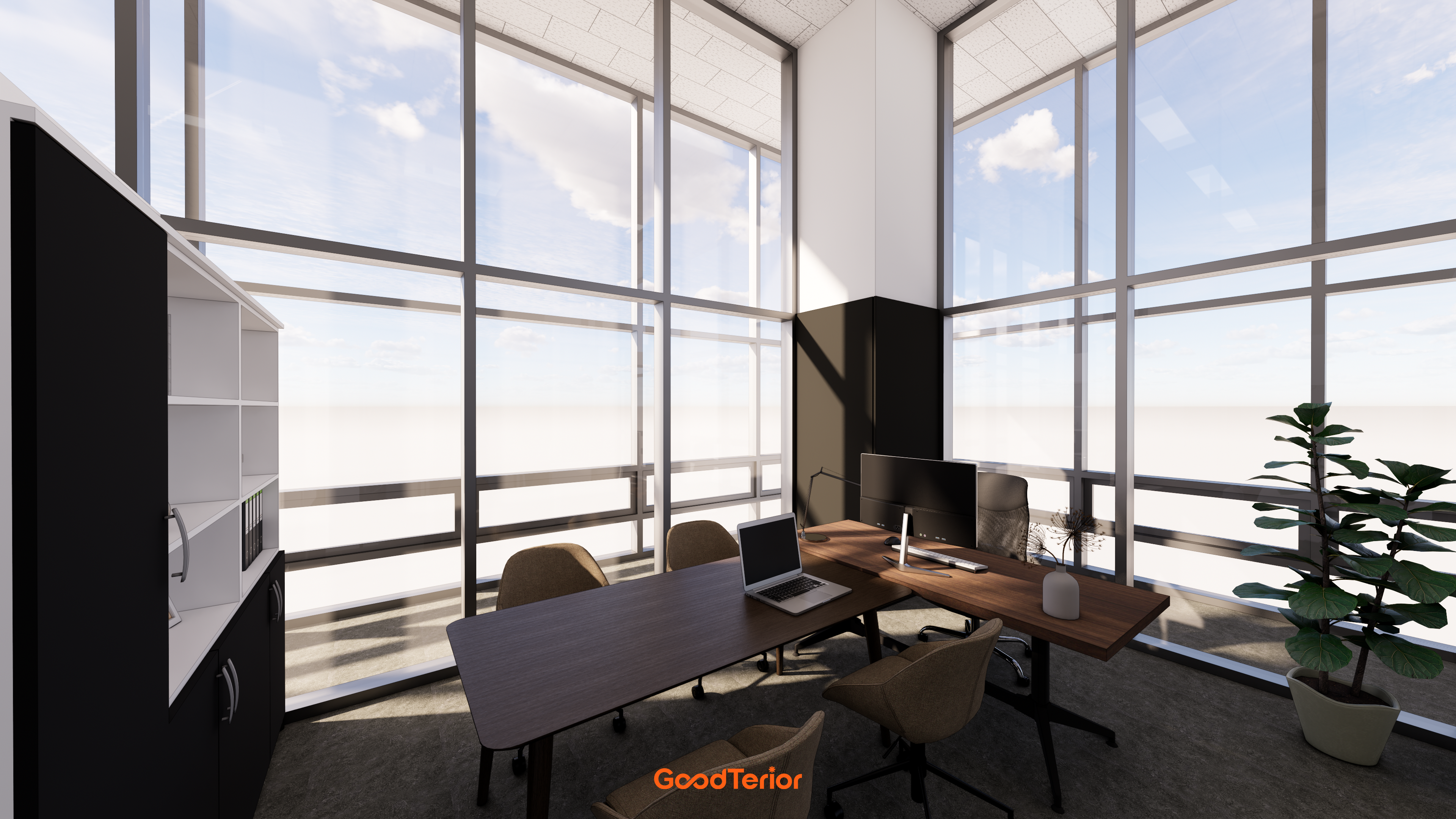
The design separates the director’s room, an executive room and the central work area, with a pantry beside the entrance. Use the actual plan to check visitors entering while staff prepare drinks. Decide whether visitors pause outside the glass door or are guided to the inner wall before placing furniture and information stands.
Godeok Jisik Gongjakso, 26 pyeong: a dark entrance and its inner wall
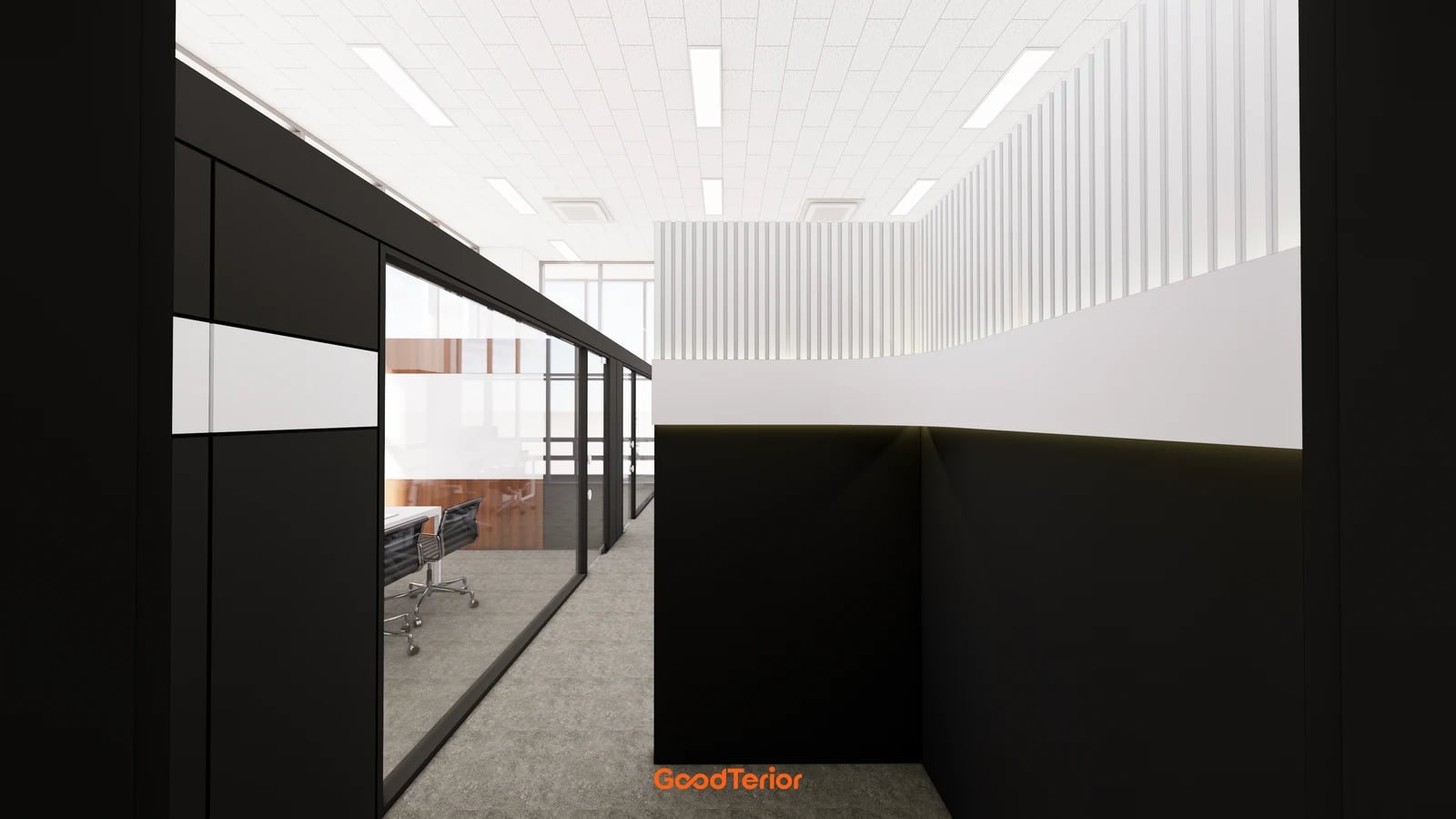
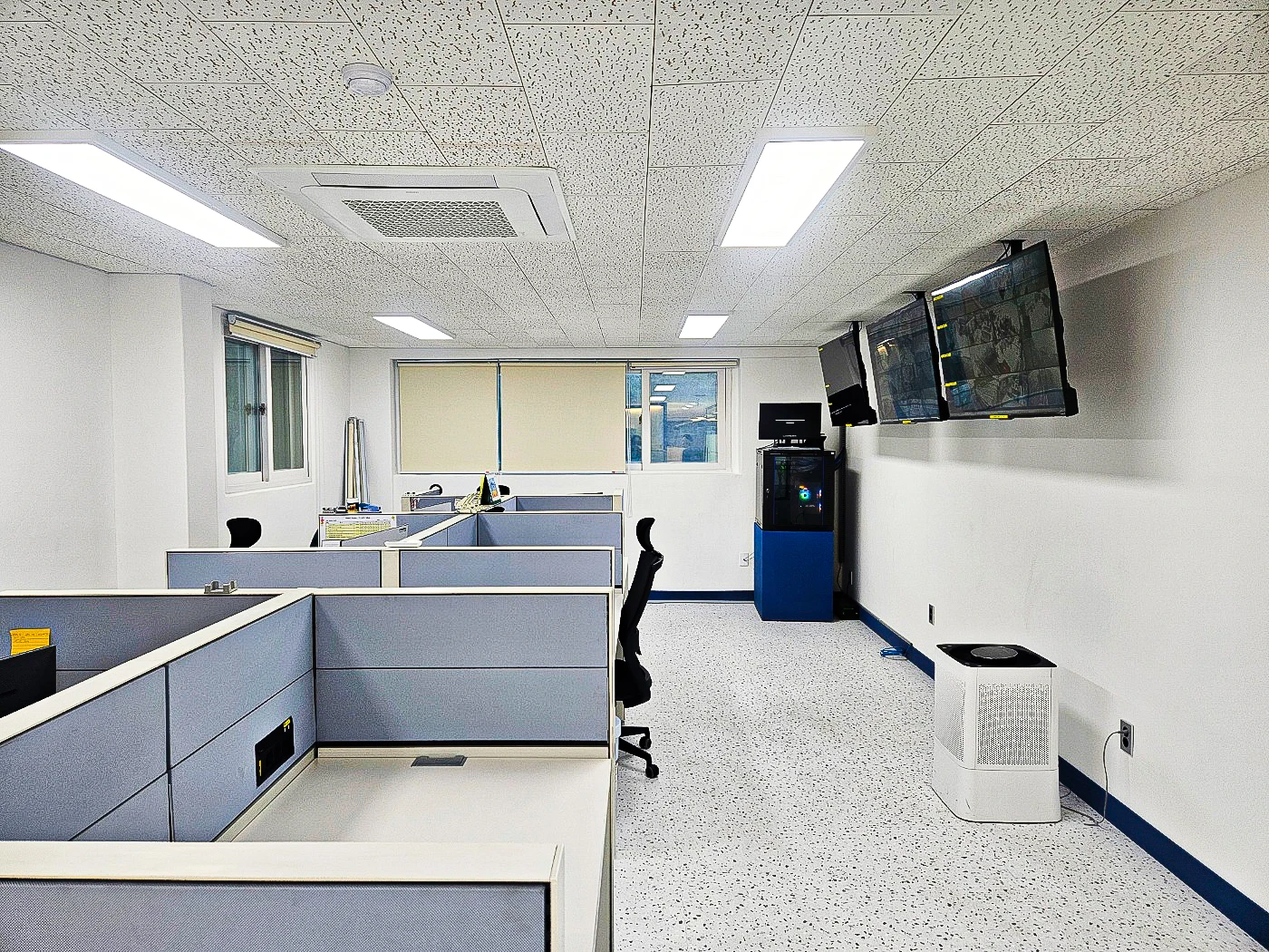
The Goodterior Godeok Jisik Gongjakso 26 pyeong office design lists 86.05㎡ and 26.03 pyeong. Its exterior entrance design places a company sign and horizontal lighting against a dark surface. The selected image looks inward from the entrance, showing white bands across dark surfaces and a route beside the wall.
Unlike the broadly screened glass doorway in Namyangju, surrounding walls define this entrance. The outside company sign and the inner wall are different surfaces, so a single front elevation cannot settle both. Compare what a visitor faces after entering and the angles from which desks or storage behind the wall become visible.
The public plan description places a meeting room beside the entrance, with work areas and the director’s room farther inside. A business that guides external visitors straight to meetings could consider directions on the wall near the entrance. If a staff member must come to greet them, a place to pause is also needed. The dark wall does not prove desks are screened from every direction.
When matching the door and wall in a dark colour, check the handle and opening side in their actual positions. Put horizontal bands or lights on an elevation that includes the access equipment and frame. If the existing door stays while the wall changes, inspect frame junctions and demolition marks. Repainting and rebuilding doors or walls are different quotation items.
Seongnam, 34 pyeong: reception beyond an arched glass entrance
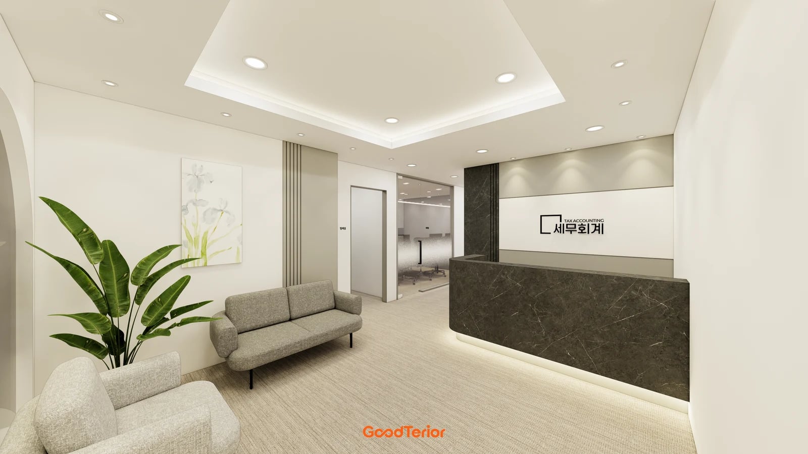
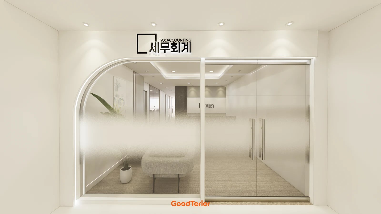
The Goodterior Seongnam 34 pyeong tax accounting office design uses 34 pyeong in its public title and lists 114.74㎡ in its project check. The cover shows an arched surround around a glass entrance with horizontal screening. This section looks inside at the sofas, reception desk and company sign behind it.
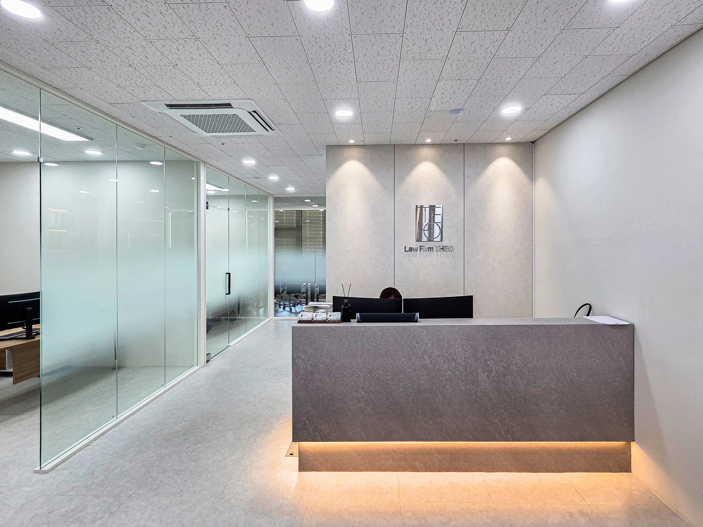
Where Namyangju separates markings on the doorway and interior wall, Seongnam allows comparison of the entrance form with a dedicated reception area. Trace a visitor entering, locating the desk and moving to a sofa. A conspicuous company name and an easy greeting process are separate questions. Include equipment and paperwork on the desk when reviewing sightlines and staff working space.
The public plan separates waiting, open workstations, individual accountant rooms and a meeting room. In a visitor-facing office, review which room entrances and desks can be seen from the waiting seats. Compare the glass screening from a seated position as well as while standing. Blurring in a render is not evidence of real privacy performance.
Building an arched surround, sign wall and reception desk differs in scope from adjusting a doorway alone. When revising the budget, separate glass and frames to retain, walls to build and furniture to move. Identify who fabricates and connects the curved surround, lighting and signs. Entrance decoration cannot replace an independent consultation room where one is needed.
Connecting the outside view with the work inside
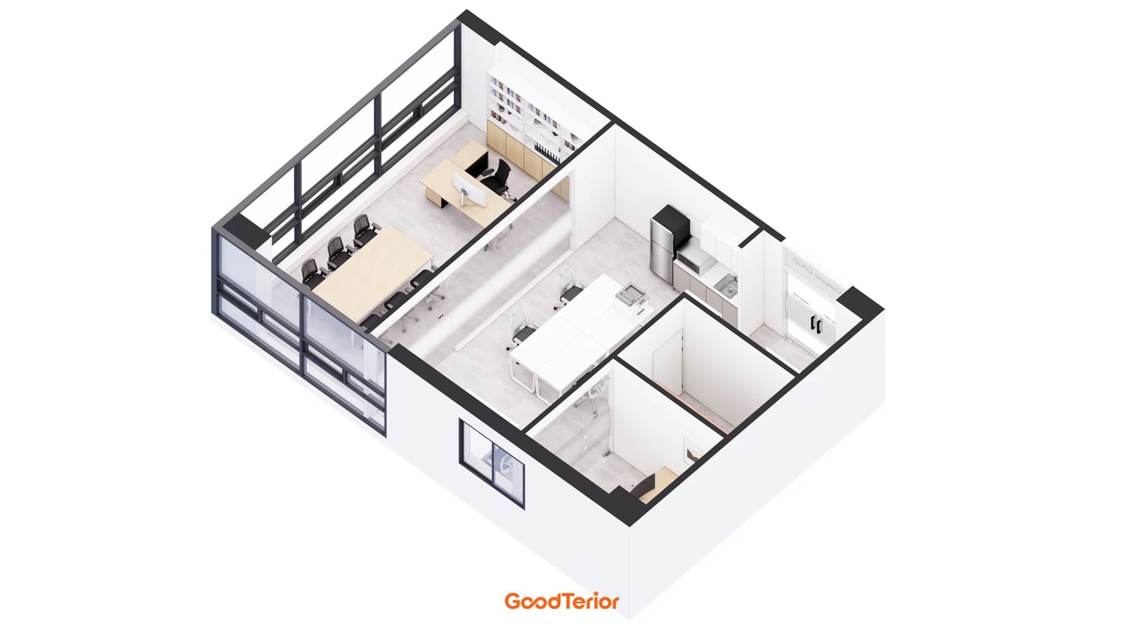
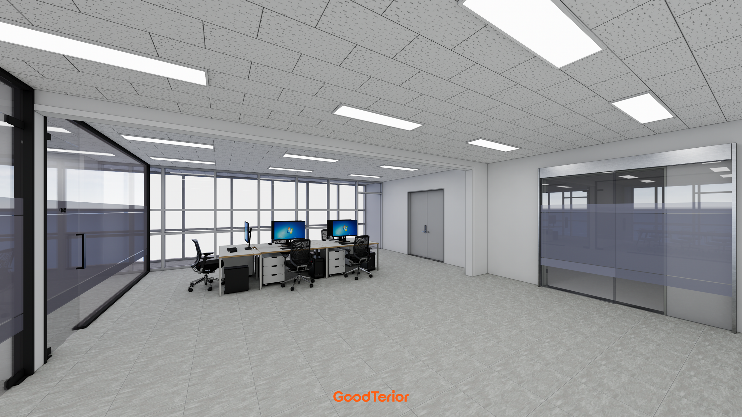
The overhead Namyangju design relates the entrance-side wall to the central desks and separate rooms by the windows. It reveals furnishings beyond a single entrance photograph. Compare all three examples using the same question about where visitors go after crossing the doorway, rather than ranking them by glass area or sign size alone.
If identifying the company is the priority, check the sign from each corridor approach. If desk exposure is the concern, compare closed-door screening with walls and furniture visible when the door opens. Where visitor reception is central, include the desk and waiting seats. These are ways of assigning information and space to specific needs.
On site, record the existing door, frames, surrounding walls and ceiling, and floor junctions. Confirm the permitted alteration scope with building management and coordinate the selected door and access equipment against responsible suppliers’ information. Then separate glass screening, lettering, new walls, lighting and making good in quotations. Match actual opening space and installation dimensions before ordering a form seen in an image.
Review approaching along the corridor, opening the door, pausing for guidance and moving to the meeting room or work area. Distinguish lettering that may change with a company or department name from wall finishes intended to stay. Office entrance decisions become clearer when company identification connects to guidance through the interior.
Ask us about your interior project
We can discuss a quote and design suited to the space you are planning.
Request a free consultation