Dermatology Clinic Interiors: Reception Forms and Background Finishes in 3 Studies
Compare reception furniture with its background wall and ceiling. Public design studies from Sinchon, Guro and a 42-pyeong clinic illustrate light curves, a small desk beside a column, and a timber-tone counter against a dark sign band.

Before you begin
- Compare counter fronts with the form of background walls and ceilings.
- Check real samples instead of identifying products from rendered colours and grain.
- Separate furniture, wall finishes, lighting and signage in the quotation scope.
Sinchon, 43.78 pyeong: light curves and a timber-tone ceiling
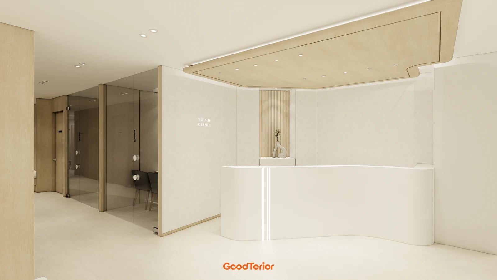
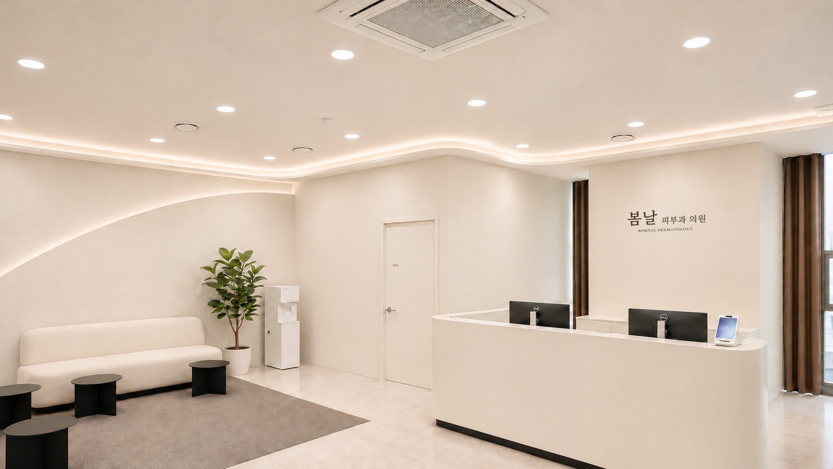
The Goodterior Sinchon clinic study lists 144.73㎡, or 43.78 pyeong. The cover shows reception in relation to adjacent walls and waiting seats; the section image brings its front closer. All three cases in this article are public design renders used to compare forms and finish placement.
The counter has rounded ends and a changing upper profile. A broad light wall behind it includes a small vertical-slat feature. Timber tones appear mainly overhead and on adjacent walls. When choosing light furniture, divide the scene into front, background and upper surfaces to decide where a second colour belongs.
Draw both the front elevation and worktop outline for curved furniture. Rounded ends still require decisions about staff-side depth and equipment space. Place actual computers and paperwork, then check what visitors will see. Establish the working surface through the reception process and equipment list before reproducing the rendered profile.
Check the boundary between light furniture and walls through actual samples and joint lines. If different suppliers handle them, compare the approved samples together instead of passing on only a colour name. Mark the extent and edge of a proposed timber-tone ceiling. Review rendered lighting separately from confirmed luminaire and installation information.
Guro, 27 pyeong: a curved desk beside a column with green accents
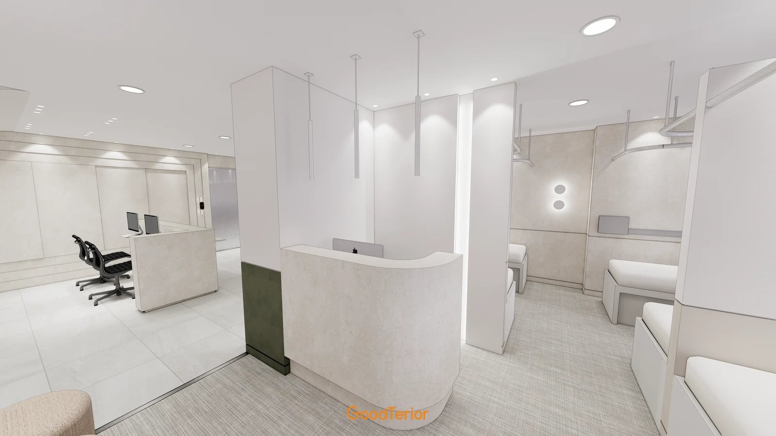
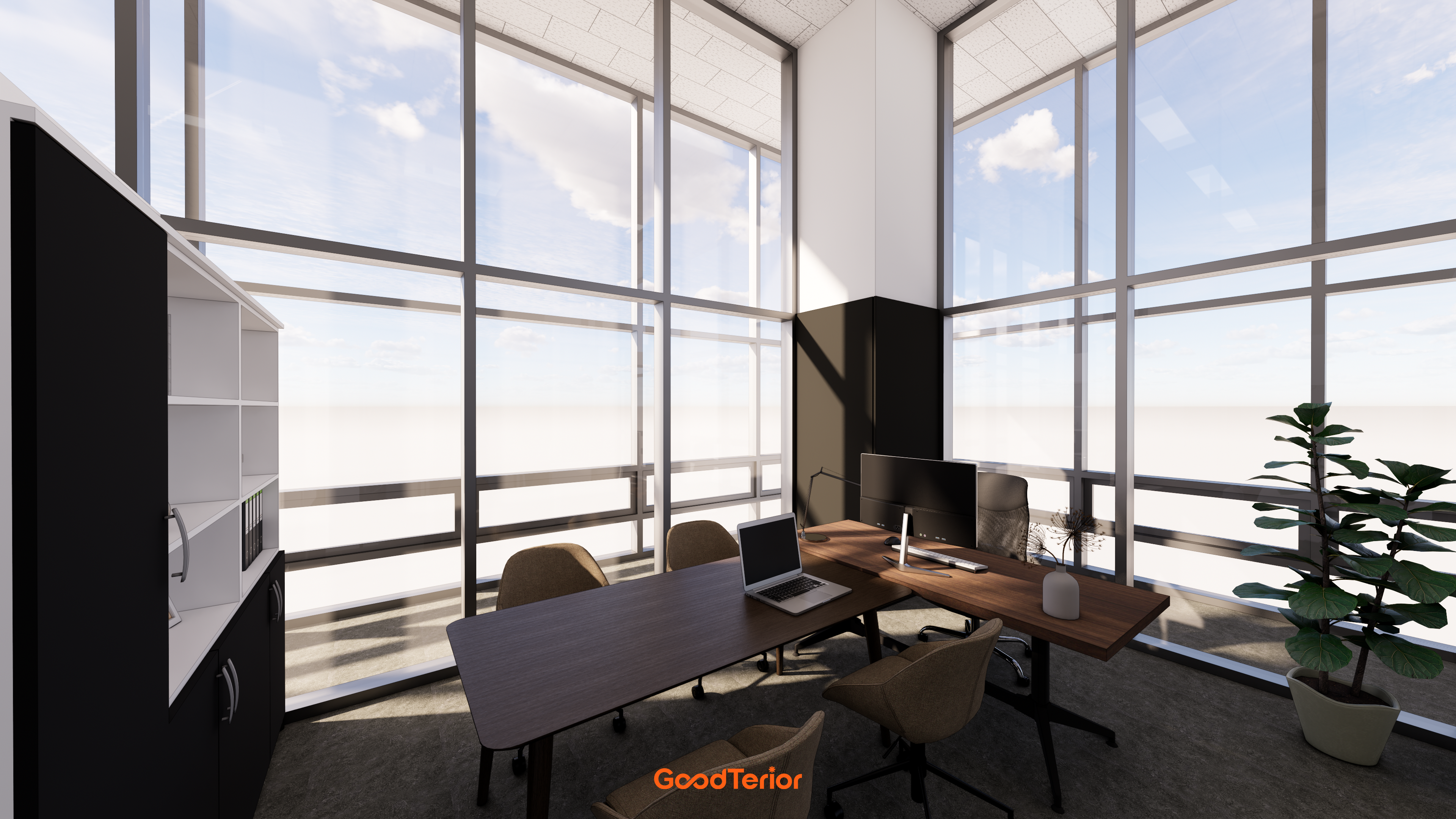
The Goodterior Guro clinic study, 27 pyeong lists 89.26㎡. This selected scene includes a small curved desk before a large column and a straight work counter on the left. Compare its green lower panel, rounded furniture end and slim suspended lights with an arrangement organised around one long counter.
Where a column stands in reception, distinguish the structure that remains from new covering finishes. Here a broad white face remains while colour occupies part of the lower surface. This offers a comparison with applying green to an entire wall. Coordinate its height with the furniture top, skirting and flooring changes on an elevation.
For a separate small desk, define who will provide which assistance there. Storage, power and equipment differ between repeated reception work and brief enquiries. Rather than fitting a work surface into a leftover gap after choosing the column treatment, test the staff chair and access on a plan first.
Include ceiling connections and lamp replacement when comparing suspended lights above furniture. Rendered green and light surfaces do not identify actual product codes. Compare samples for colour, grain direction, corners and plinth details. Recording column finishes and furniture as separate items makes proposed changes specific.
42.35 pyeong: a timber-tone front and dark background band
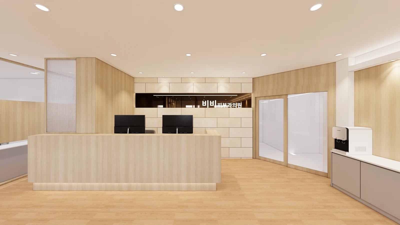
The Goodterior 42-pyeong clinic study lists 140.00㎡, or 42.35 pyeong. A long straight front is central to this view. Pale timber tones cover the counter and flanking walls, while light block-like divisions and a dark horizontal band divide the background.
Assign a role to each surface when comparing several patterns. The furniture reads as vertical timber grain, the background has horizontal divisions, and lettering sits on the dark band. Compare how floor, counter and wall patterns meet in one view as well as their colours. Redraw divisions for actual material sizes and joint methods.
Plan the lettering surface together with its background finish. Overlay final lettering and installation positions with computer screens and display items. Different parts may be obscured from seated waiting positions and from the entrance. A bright-on-dark appearance is an observation; checking actual readability remains a separate step.
Mark existing walls to retain and surfaces to refinish before choosing extensive timber tones. Confirm whether a counter replacement includes its background, door surrounds and adjacent drinks cabinet. Rendered grain does not establish solid timber. Specify products, substrate, corners and care requirements through supplier information.
Compare furniture and wall scope with the same working surface
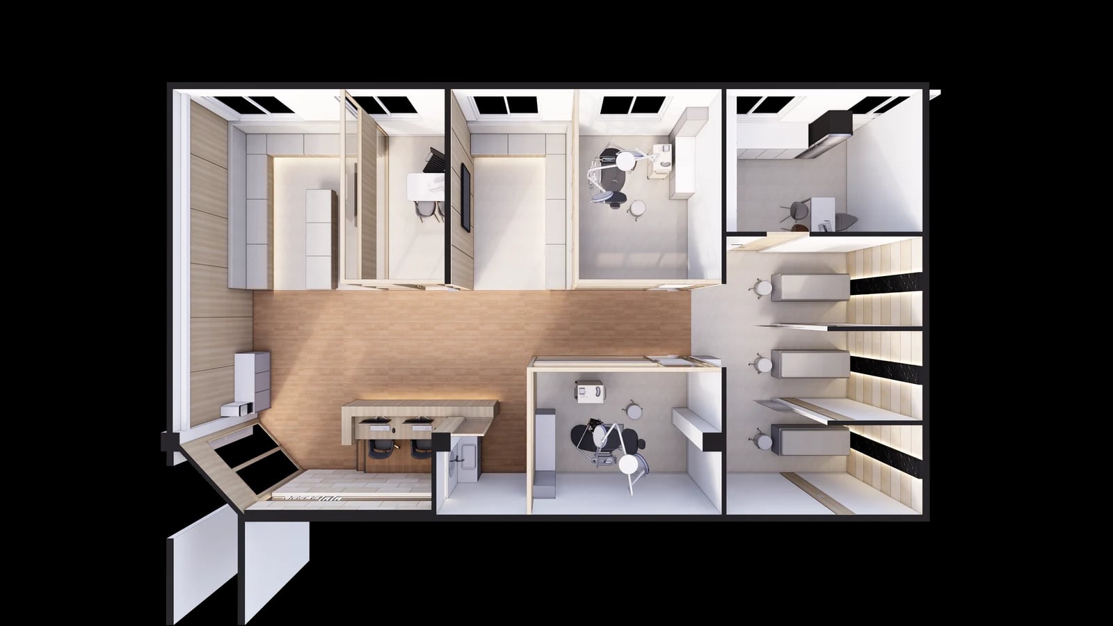
Use the same equipment, paperwork and staff positions when comparing the three studies. Sinchon combines light furniture with timber tones overhead; Guro shows a column and small curved desk; the 42-pyeong study combines a straight front with several background surfaces. Compare whether each finish proposal reduces working space or obscures equipment on the same plan and elevations.
The final image shows reception flooring continuing through waiting and the corridor. A front view alone can omit the extent of matching finishes. Mark starts, ends, door surrounds and furniture junctions on floor plans and wall elevations. For alterations, also distinguish retained surfaces from those requiring repair after removal.
Request separate quotation items for the counter body, top, staff storage, background wall and column, upper ceiling, lights and lettering. Explain reduced curves and reduced finish areas through the fabrication or installation scope that changes. Compare quotations with the same equipment and completion requirements rather than assuming one form is cheaper from totals alone.
Before approval, review actual samples, elevations with final lettering and an equipment plan together. Test chairs and storage from the staff side and reception guidance from the visitor side. Confirm cleaning surfaces and access for lamp replacement with the responsible team. Record approved product codes, application areas and fabrication and installation responsibilities to turn a selected image into ordering information.
Ask us about your interior project
We can discuss a quote and design suited to the space you are planning.
Request a free consultation