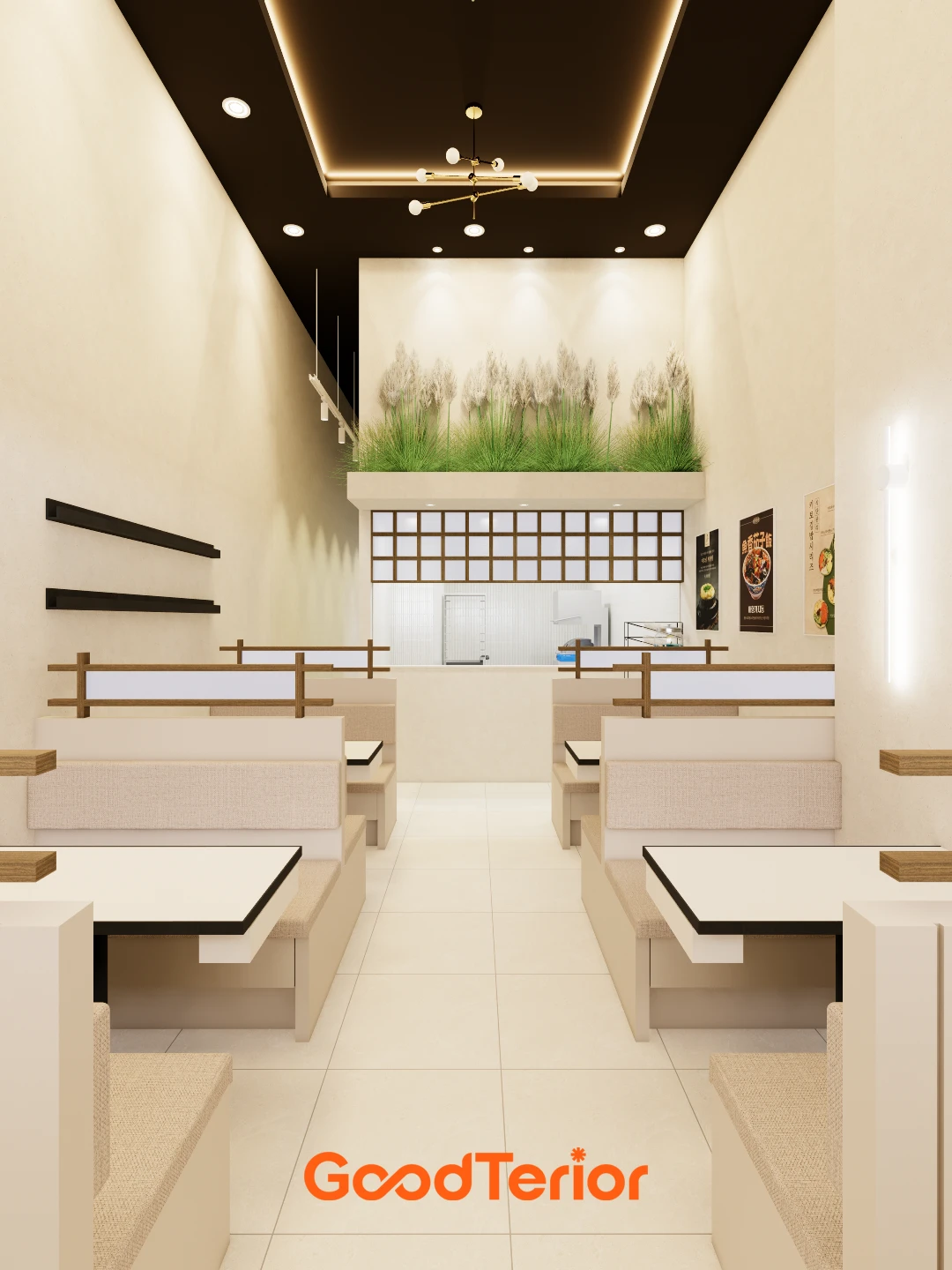
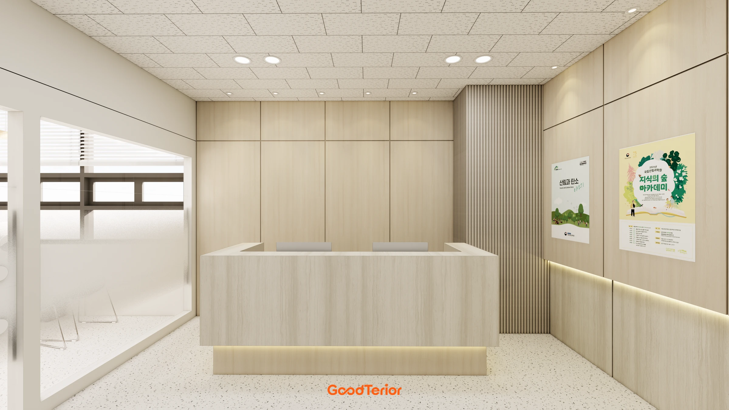
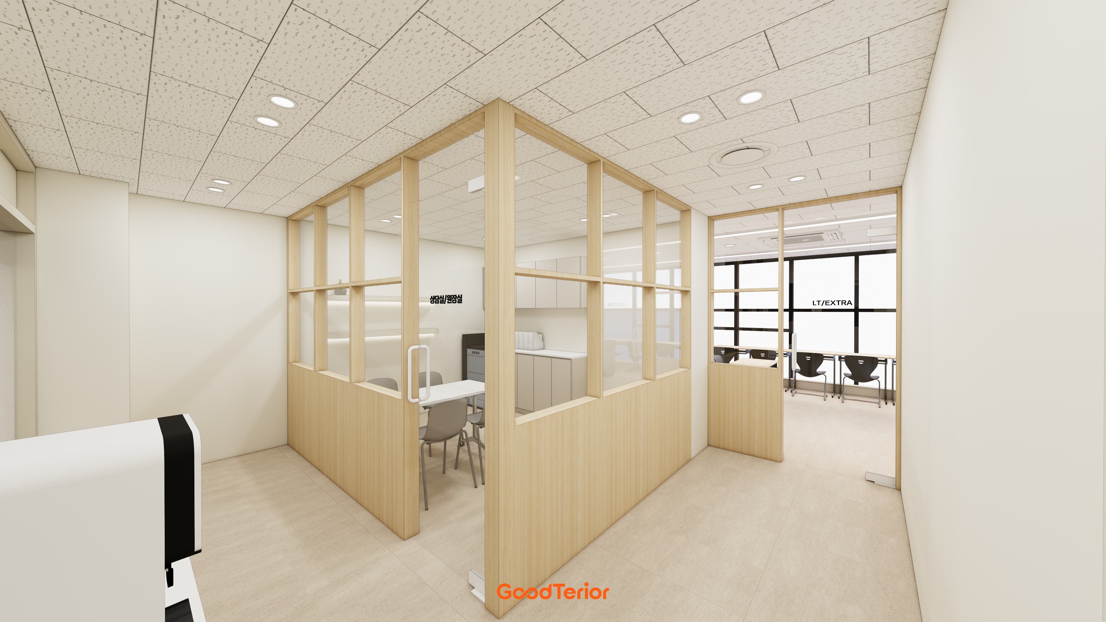
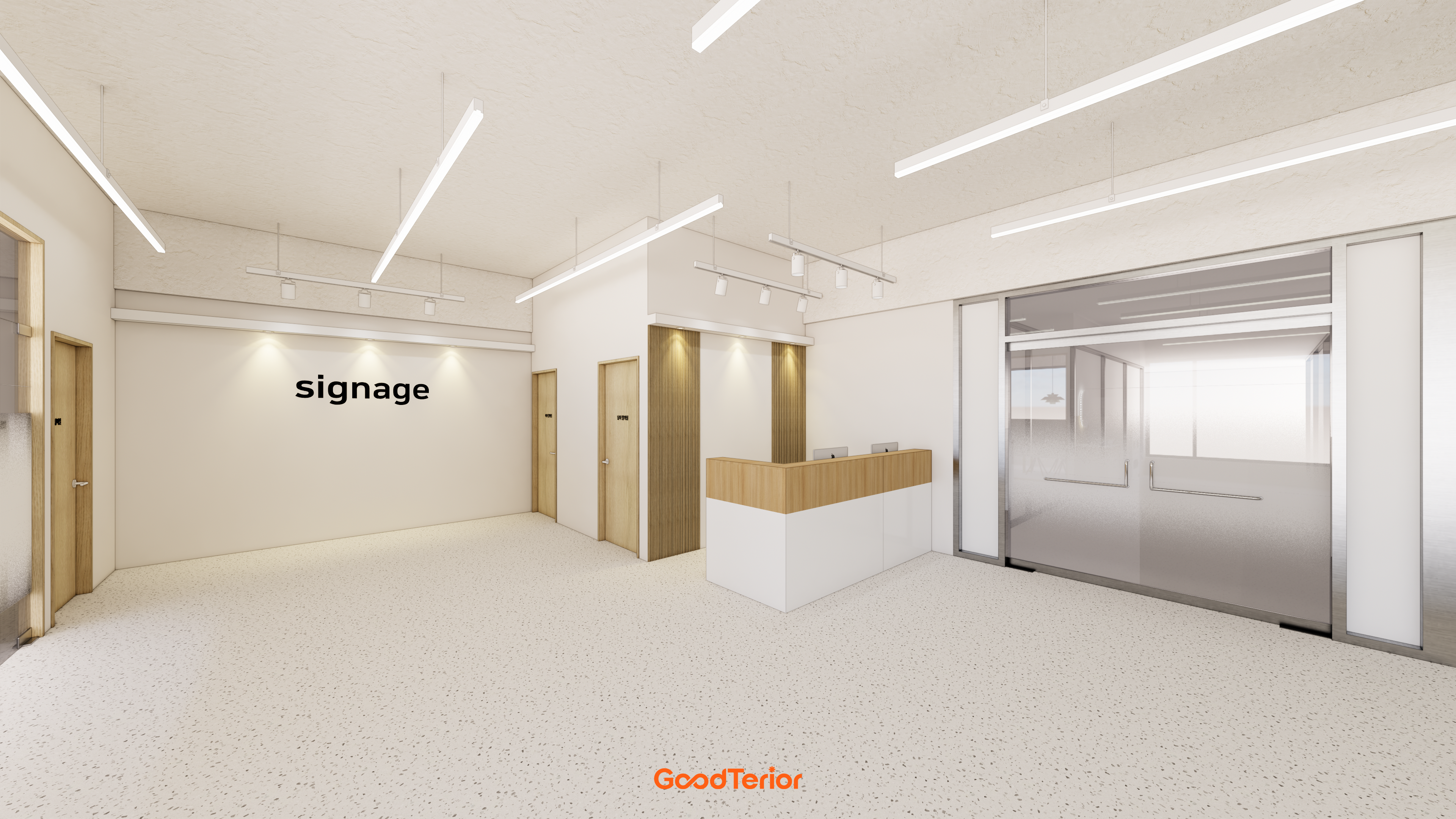
White and wood interiors: coordinating colors without looking flat
White and wood interiors depend on white tones, woodgrain coverage, lighting, and furniture together. Learn to create focal points while retaining calm backgrounds in shops and offices.

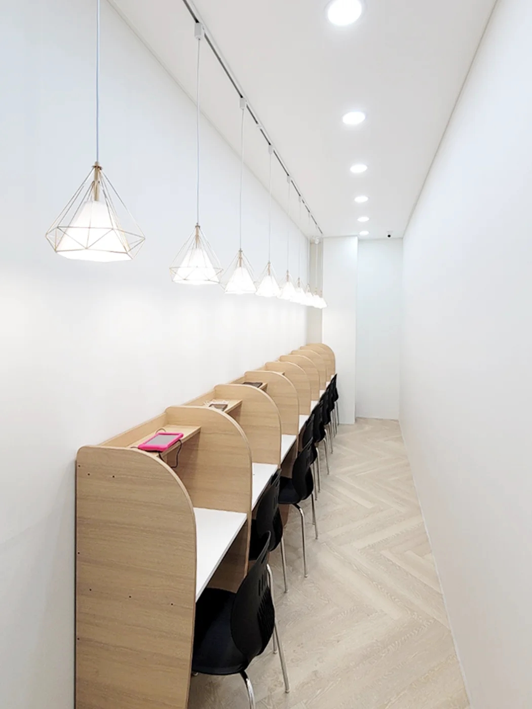
Before you begin
- Whites reveal tonal differences when placed beside surrounding materials.
- Review woodgrain scale and coverage as well as color.
- Consider signs, furniture, and merchandise in the completed color scheme.
Whites change beside other white surfaces
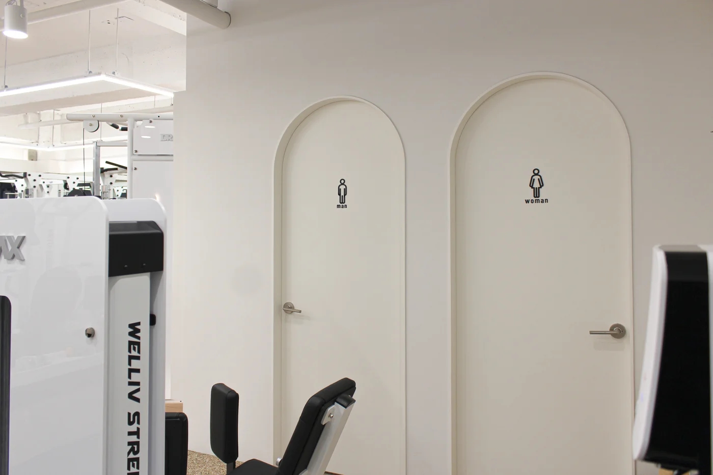
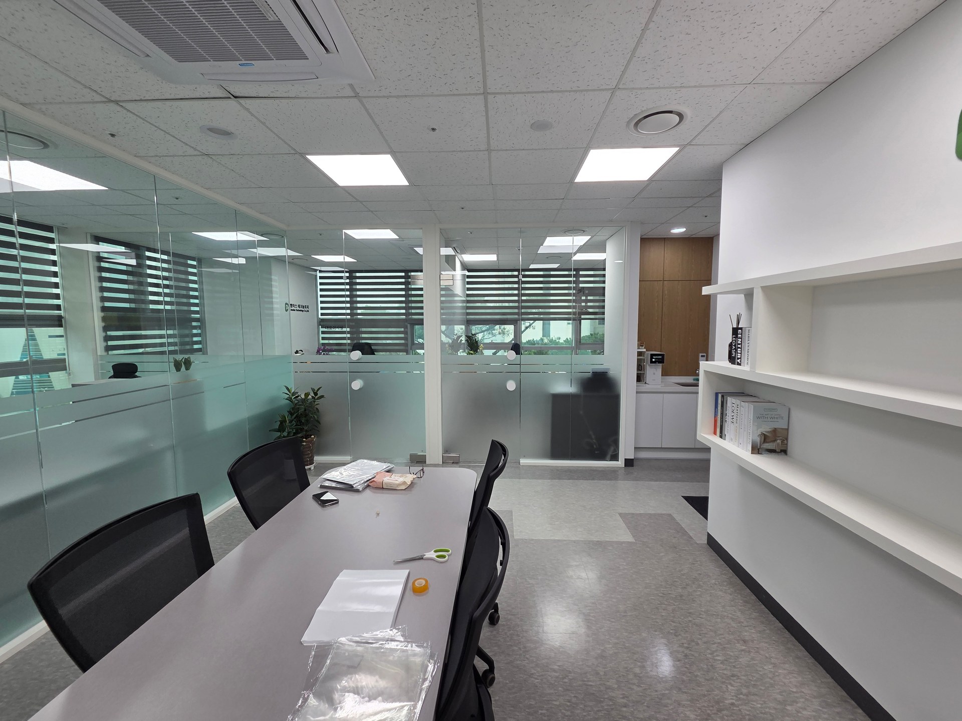
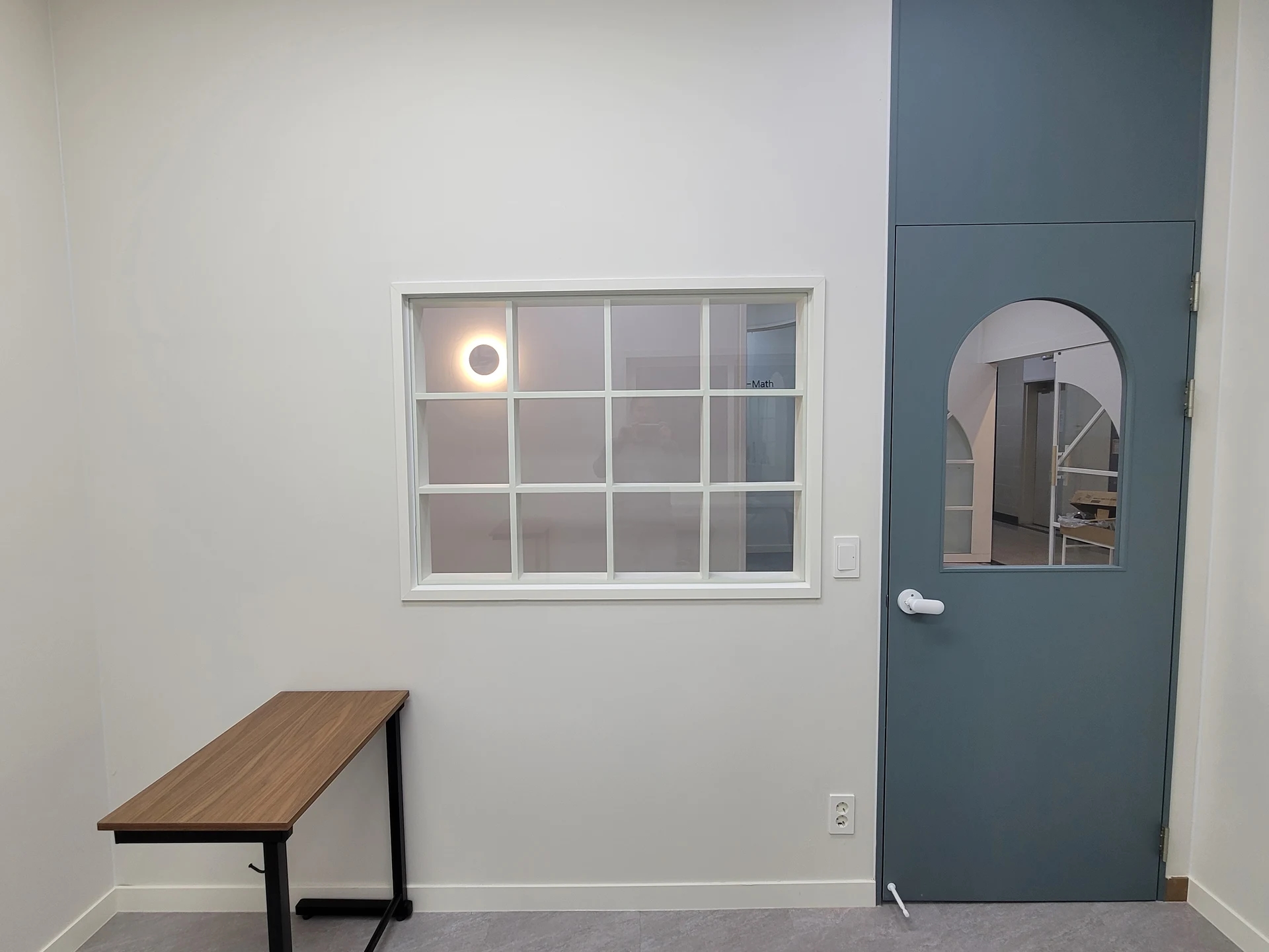
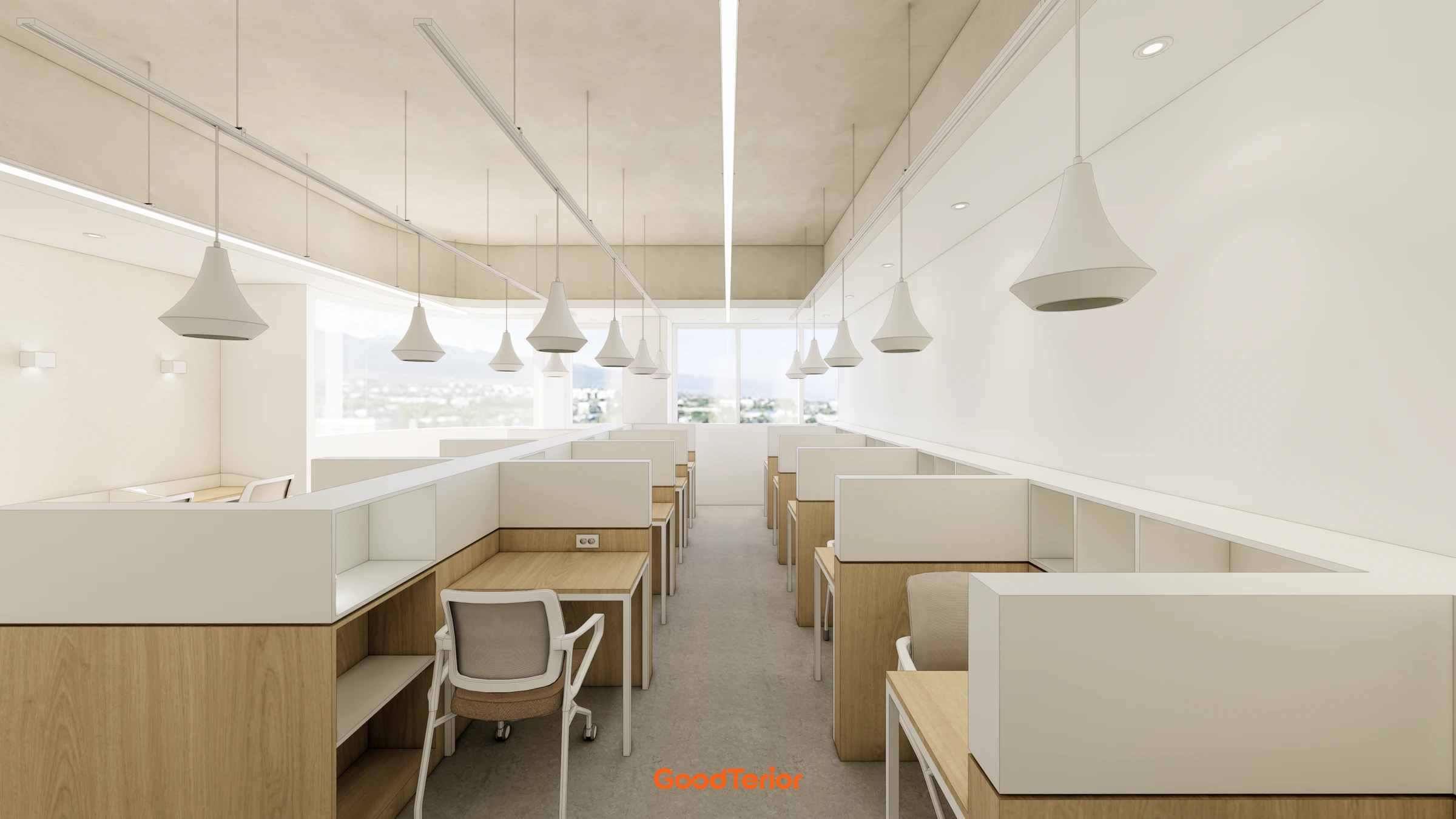
White and wood interiors are not complete after choosing just white and timber tones. Wall, ceiling, door, and cabinet whites reveal subtle differences together. A clean-looking product alone may seem yellow or blue beside another.
Compare samples first where walls and furniture meet. Exact matching is not compulsory; define whether differences are intentional or similarity is preferred. Prioritize combinations under actual lighting over photos.
The impact of woodgrain and coverage
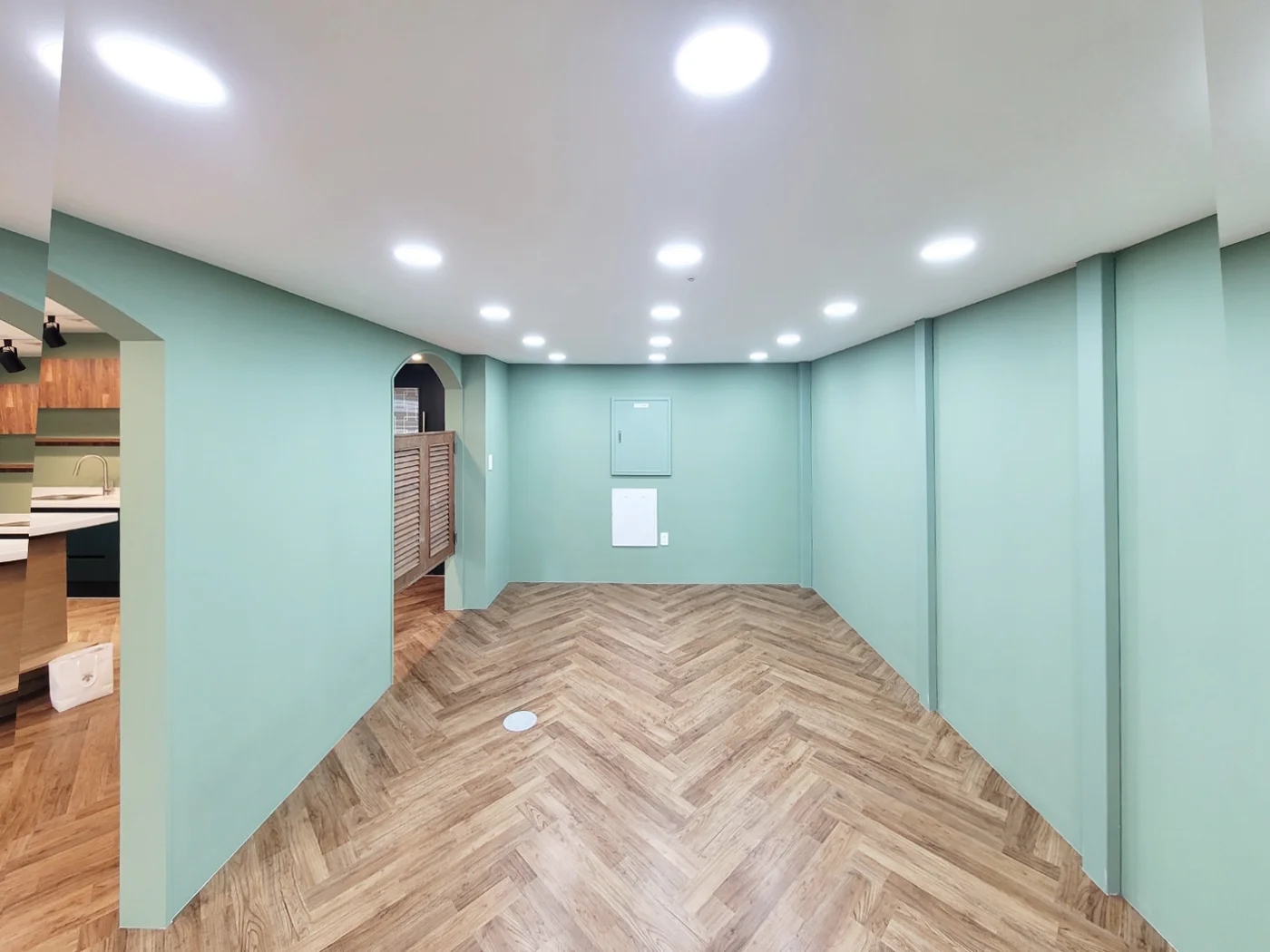
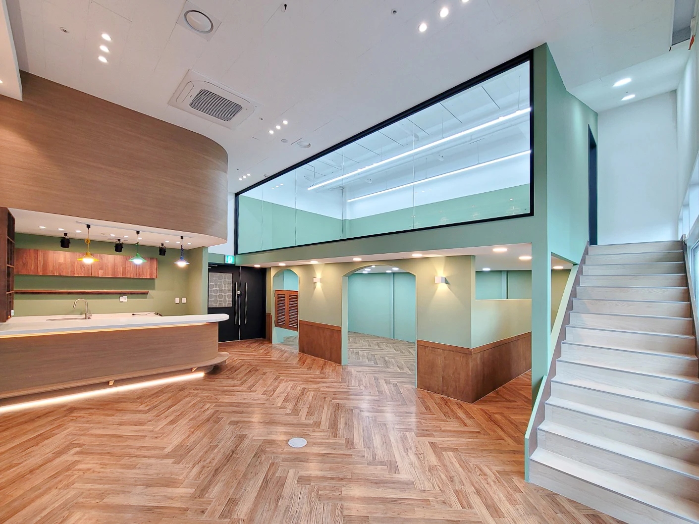
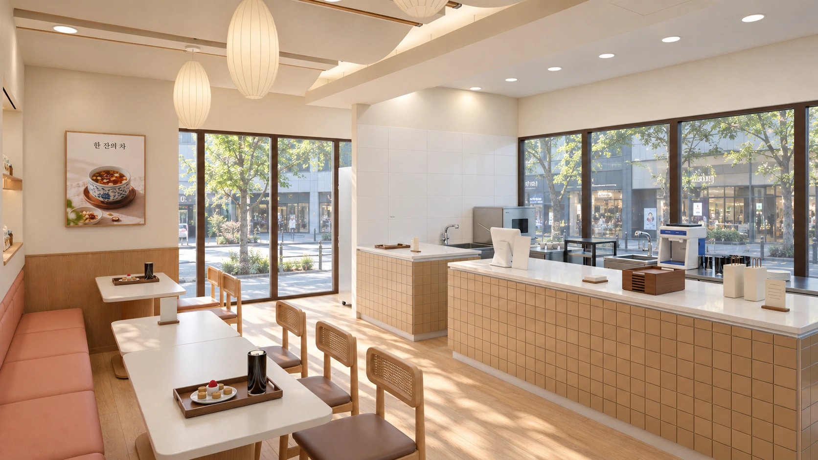
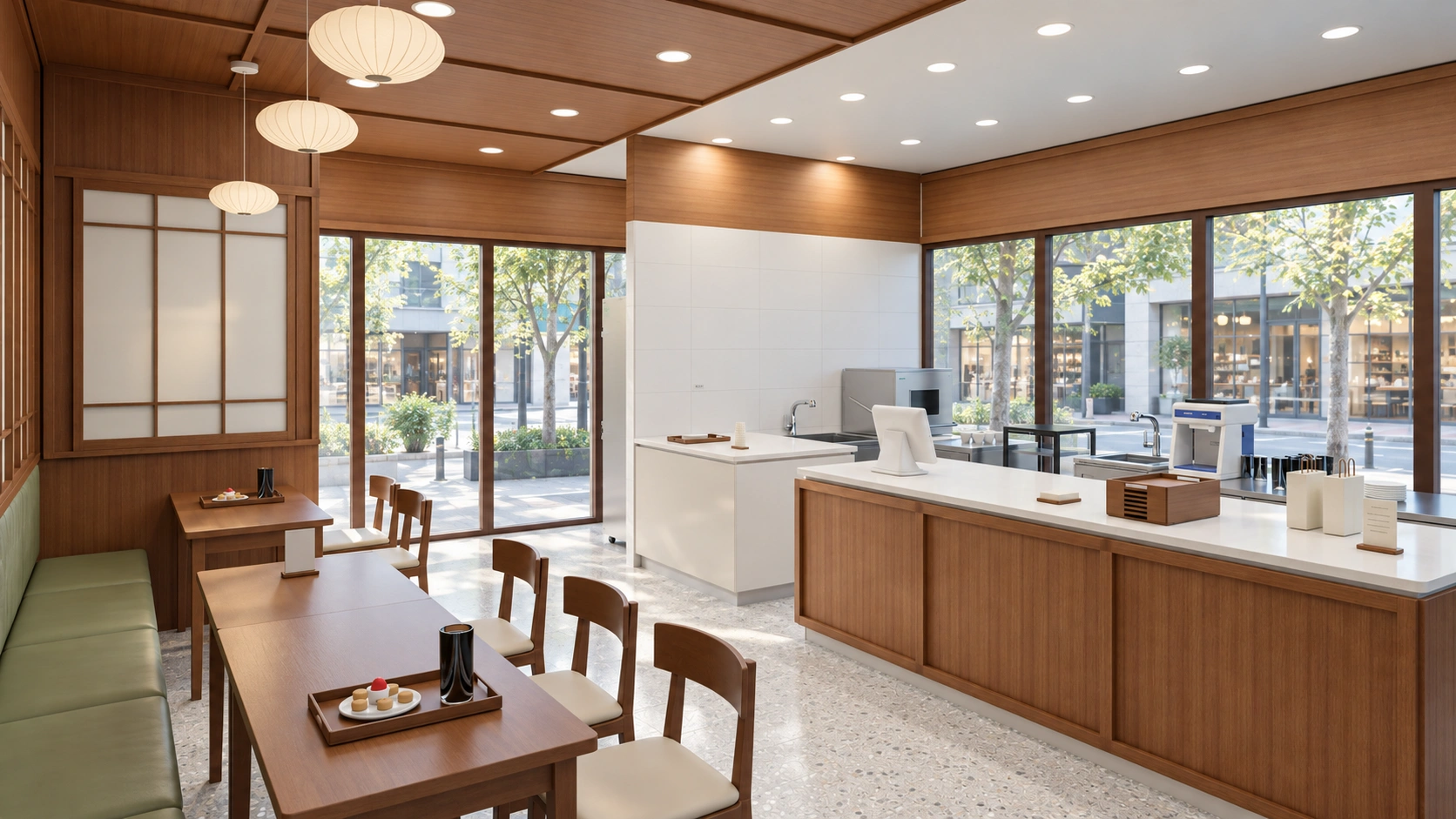
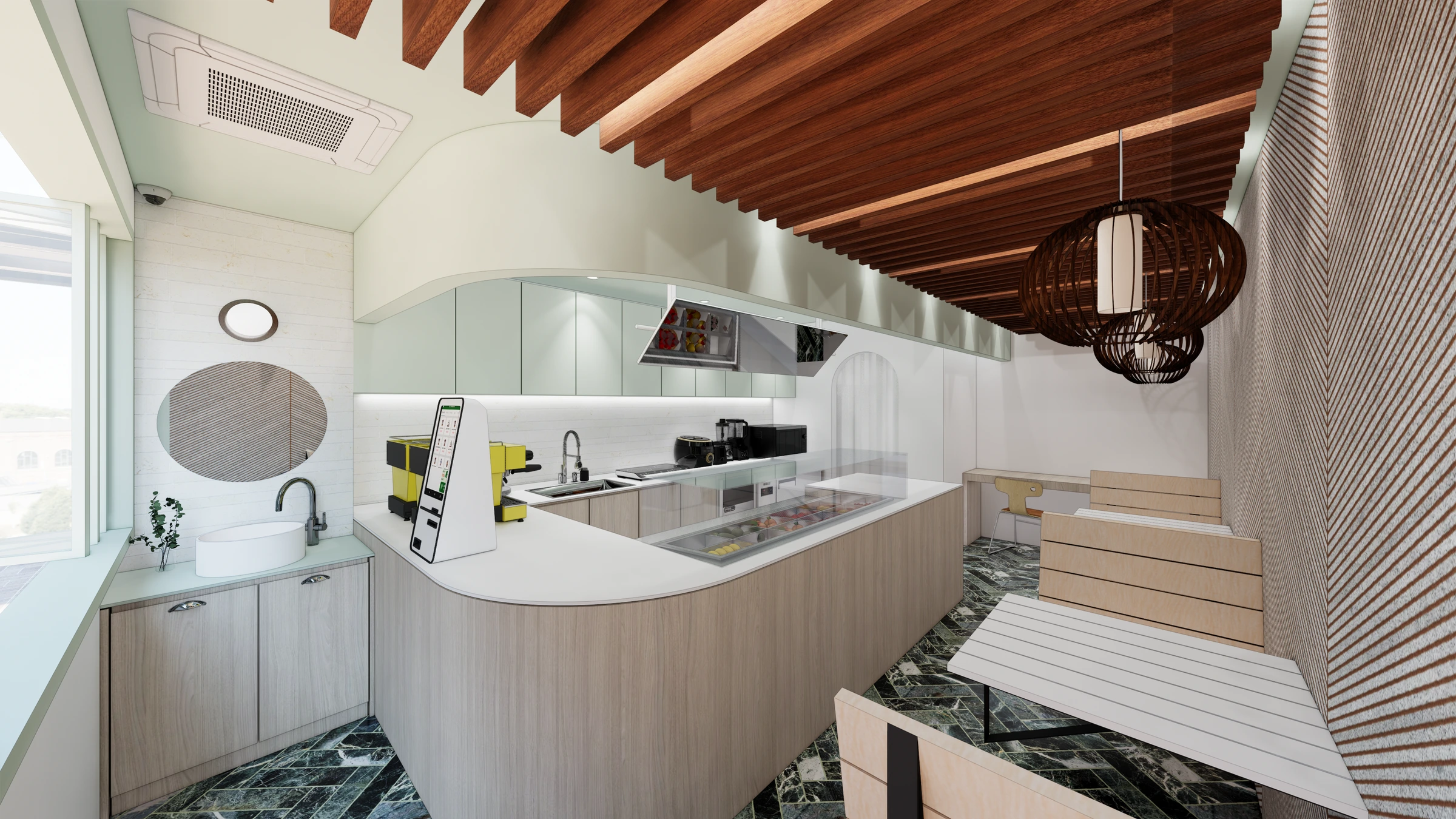
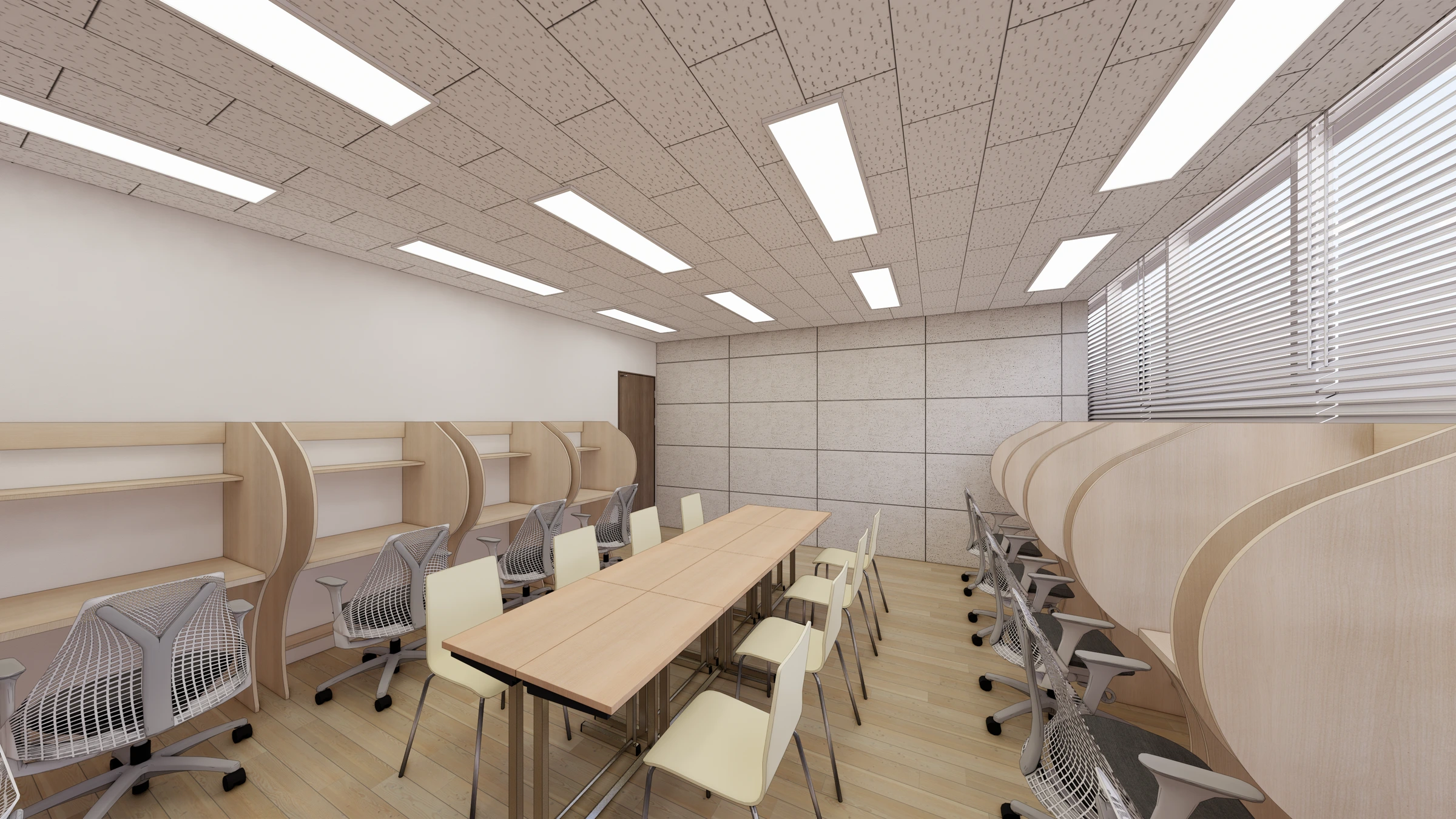
The same wood color carries different visual weight across a broad floor and a small counter. Decide whether floors, walls, or furniture carry most of it. Compare brightness and grain scale when combining wood patterns.
A natural atmosphere does not require pattern on every surface. With strong grain across a large area, compare calmer small furniture. Confirm products instead of deciding from wood-like photos whether materials are solid timber, film, or another finish.
Where accent colors can work
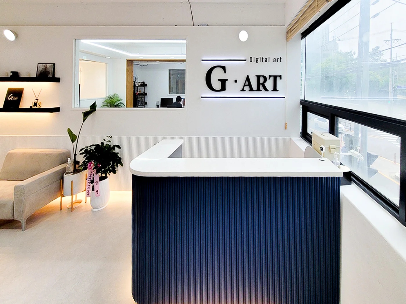
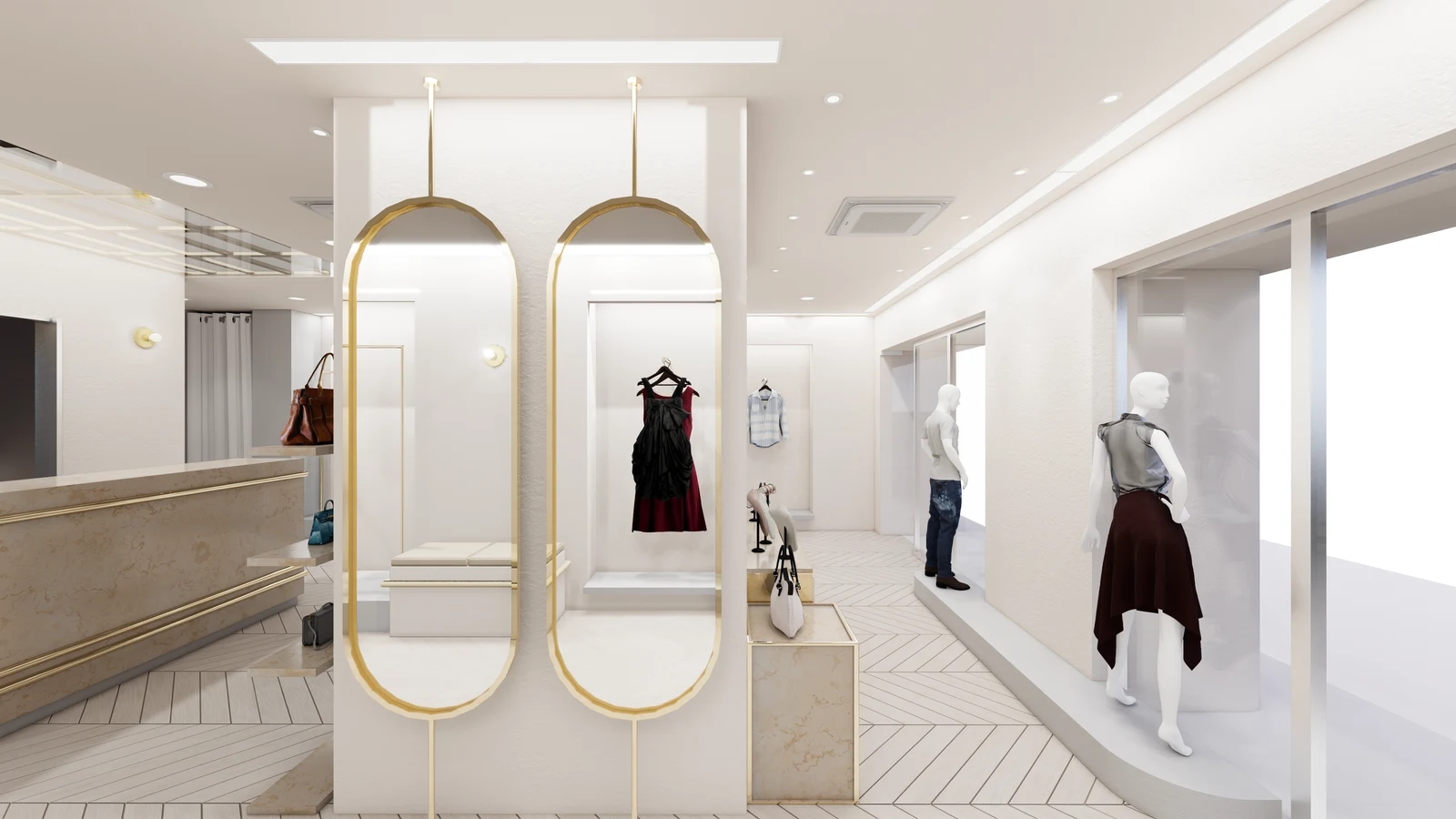
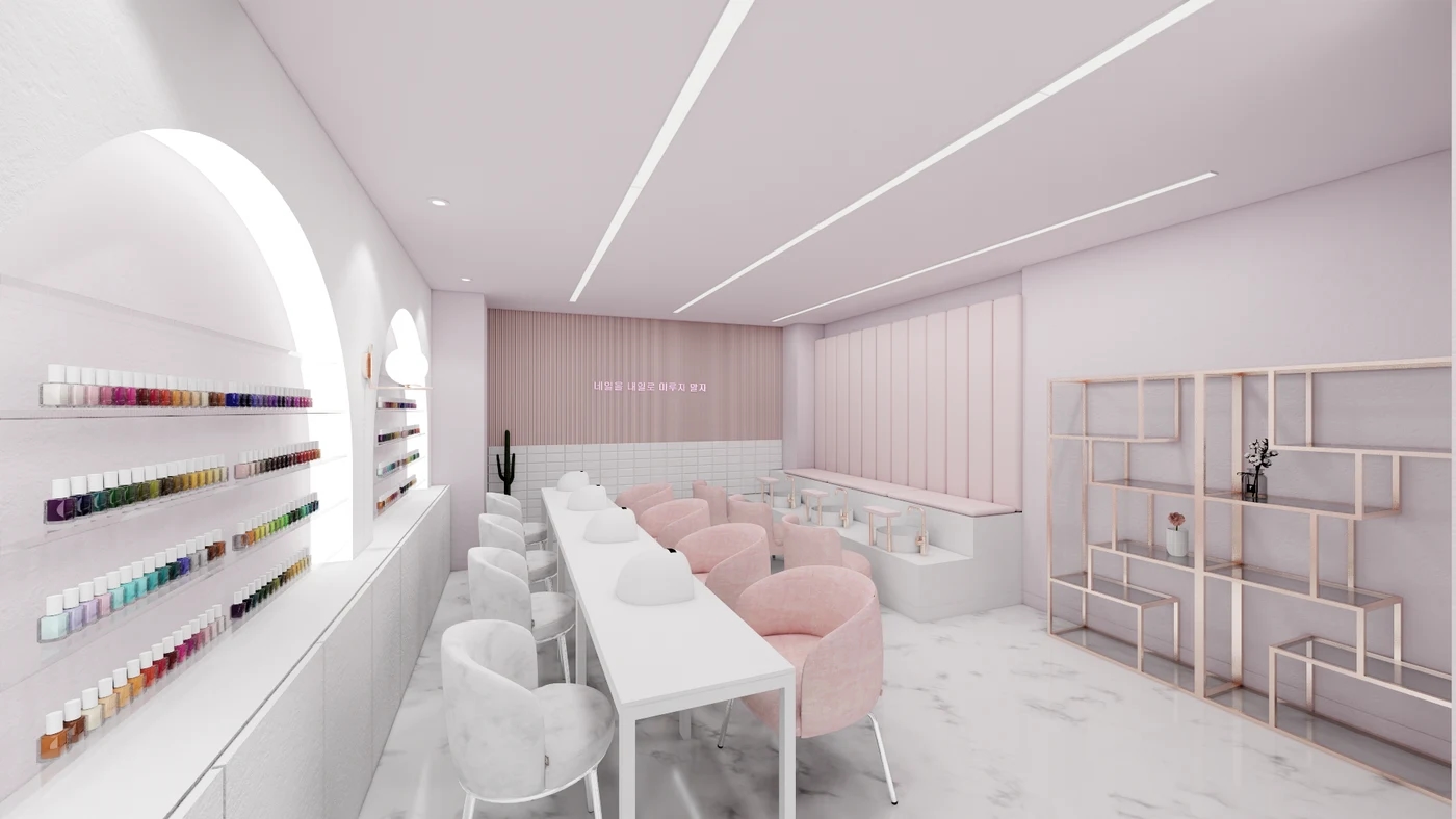
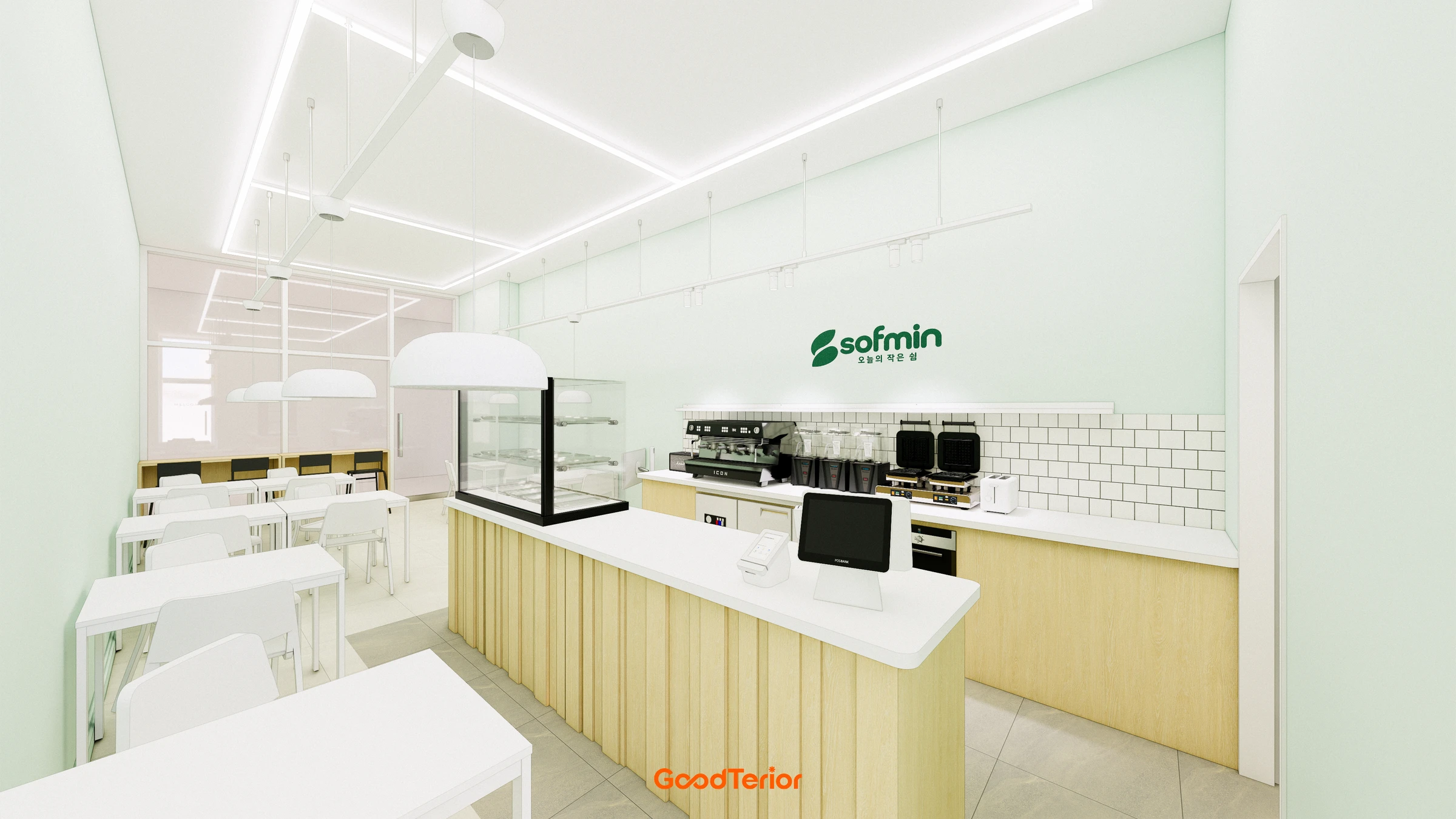
Before adding many colors out of fear that white and wood look plain, choose what customers should notice first. A logo wall, consultation counter, or product display gives accents a purpose. Light or form can also attract attention instead of color.
Dark furniture on timber flooring and color on part of a wall emphasize different positions. Compare visibility of the intended focus. Consider window sizes and furniture arrangements rather than imposing one color ratio across all spaces.
Color after furniture and equipment arrive
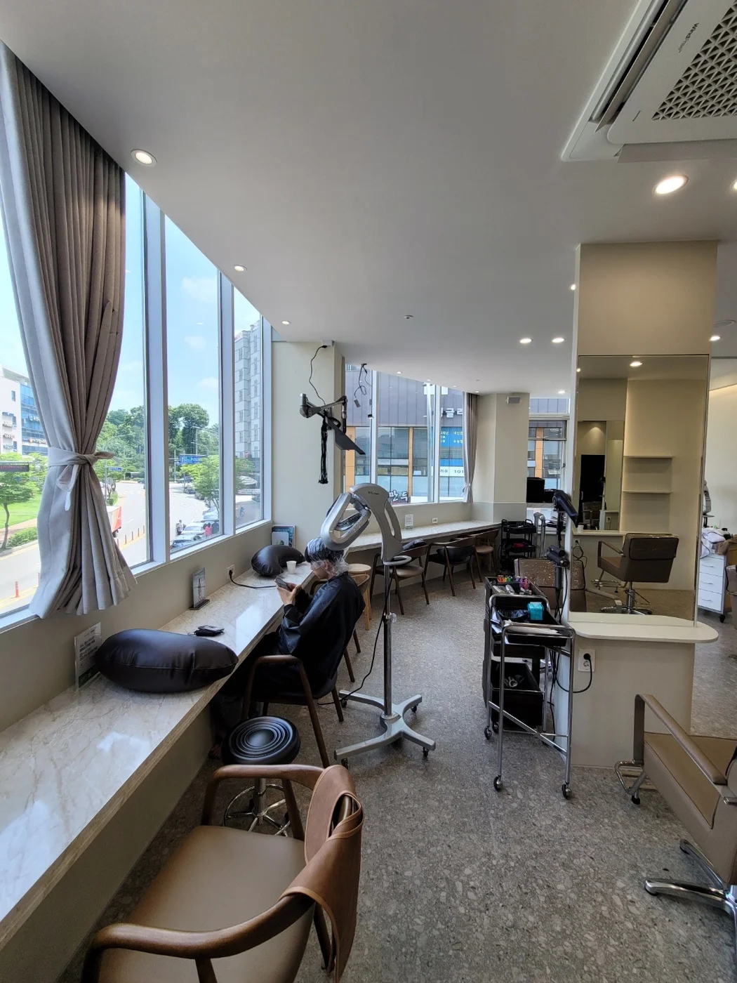
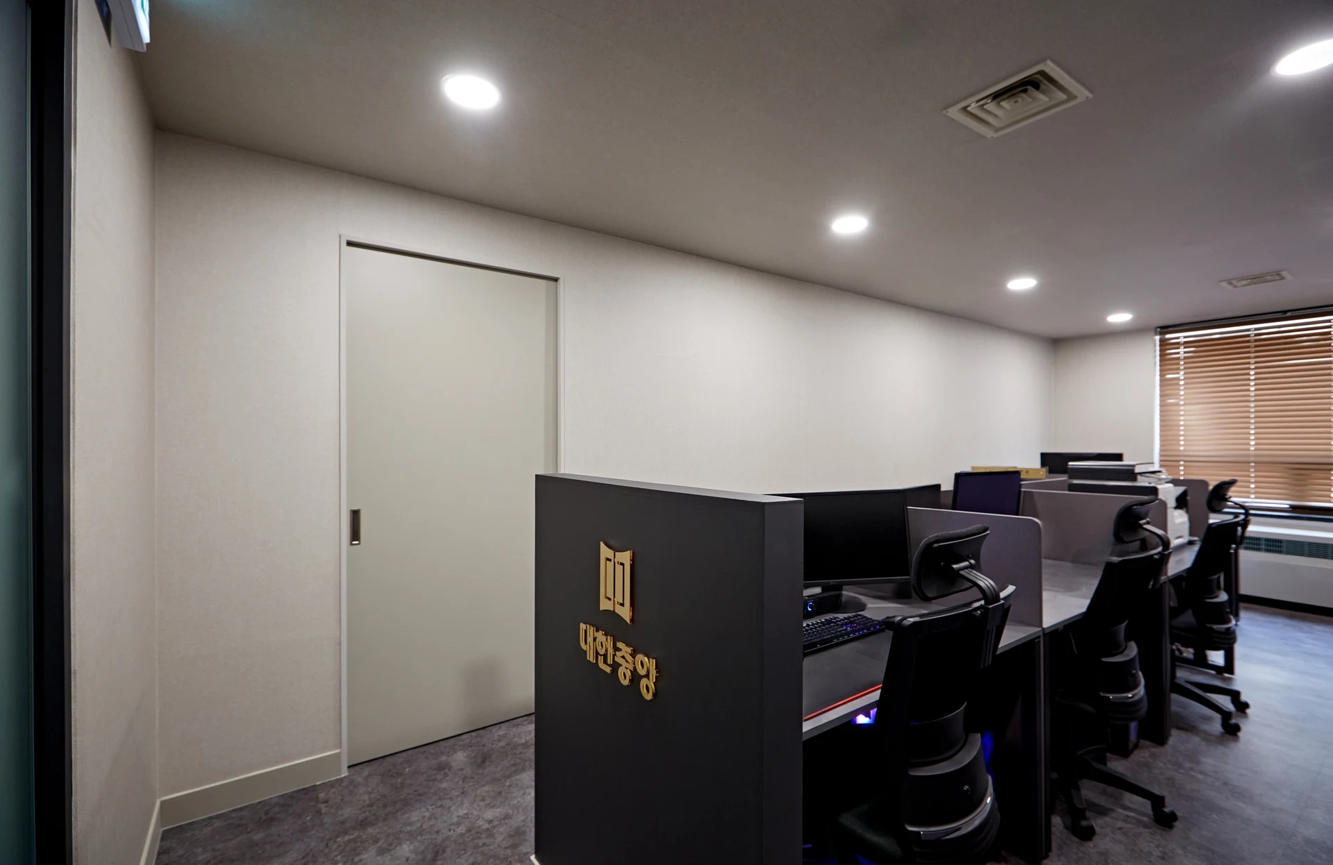
Shops add merchandise and notices, offices add monitors and files, and academies add books and displays. Empty-space photos can miss these operating colors. Place photos of actual chairs, equipment, and products beside finish samples.
Where many objects remain visible, compare simpler backgrounds. Consider cabinets open and closed. A light color alone does not establish easy or difficult maintenance; check actual products where hands and dirt contact surfaces.
White and wood for daytime and evening
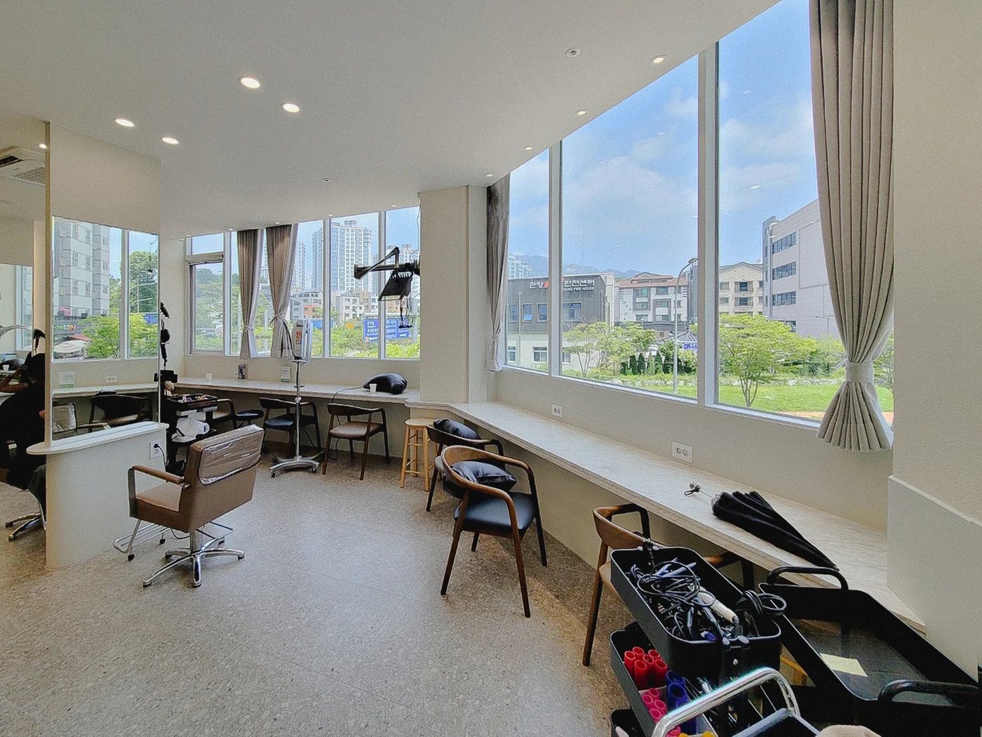
Daylight and electric lighting can change impressions of white walls and timber tones. Compare samples in their installed directions. Before replacing an unappealing material, identify effects from light and surrounding colors.
The style label white and wood does not specify products. Record selected whites, wood product codes, locations, and lighting as a set. Use related examples while completing a combination suited to this space's activities and contents.
Ask us about your interior project
We can discuss a quote and design suited to the space you are planning.
Request a free consultation