Academy interior colors: adding accents to white walls
All-white academy walls may feel plain, while scattered colors can be hard to organize. Real photographs show concentrating color on doors, coordinating desks and cabinets, and checking material samples before construction.

Before you begin
- Choose whether doors, walls, or furniture carry accent colors to avoid scattering them everywhere.
- Classrooms also gain color from books and notices, so assess desks, cabinets, floors, and walls together.
- Confirm real finish samples under site lighting and record product details rather than ordering directly from photograph colors.
A corridor concentrating color on doors rather than large walls
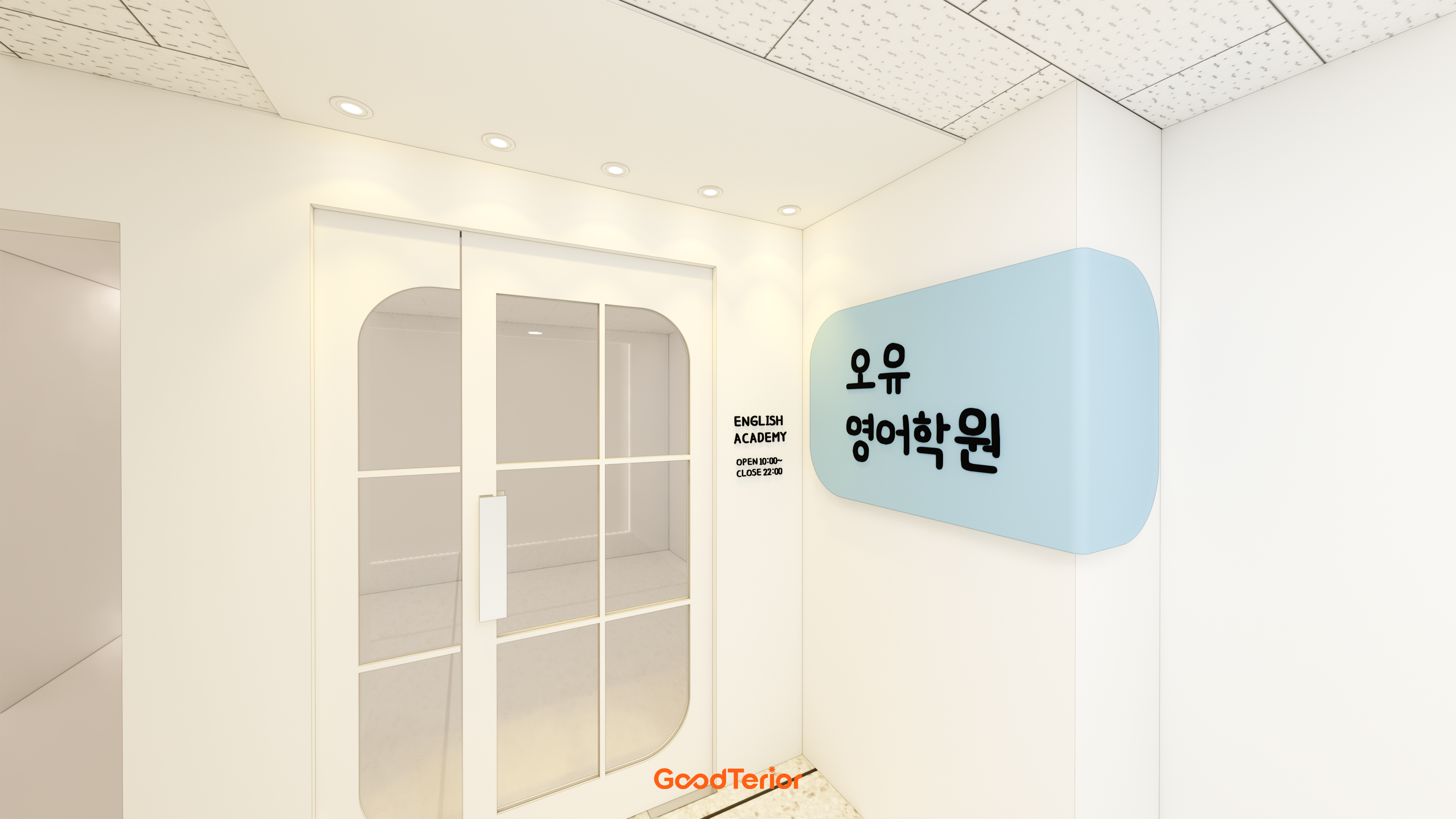
When choosing academy colors, it can be tempting to spread a logo color across whole walls. A color appealing in a small logo occupies a very different area on both corridor walls. First decide whether to show it at the entrance, repeat it on classroom doors, or concentrate it behind waiting seats. Placement changes a color's visual weight.
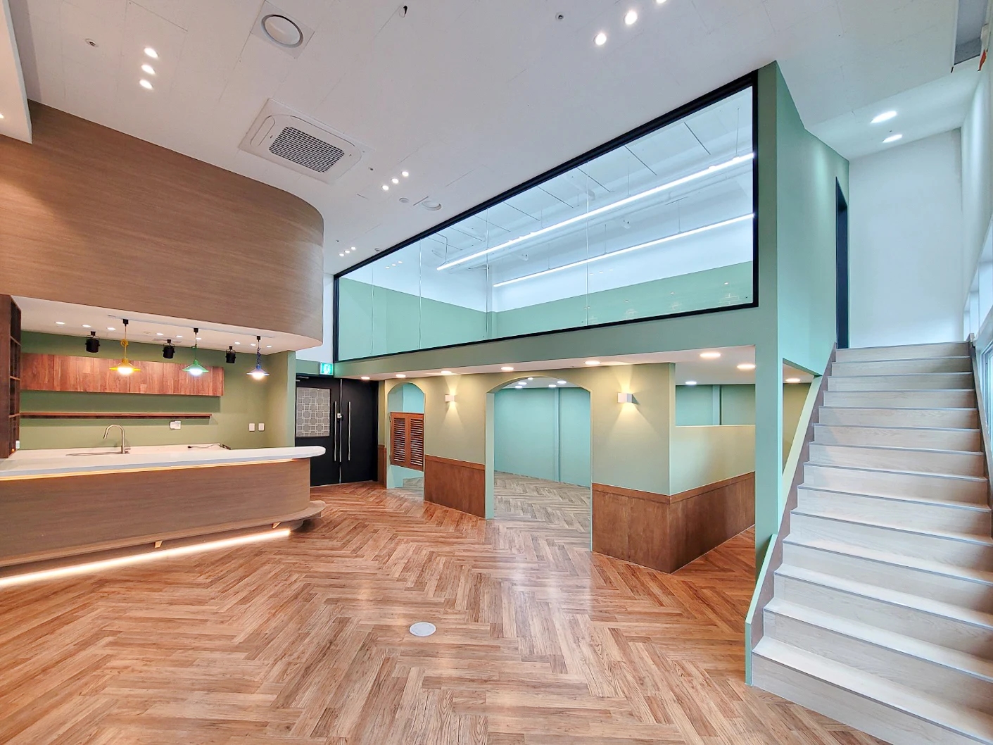
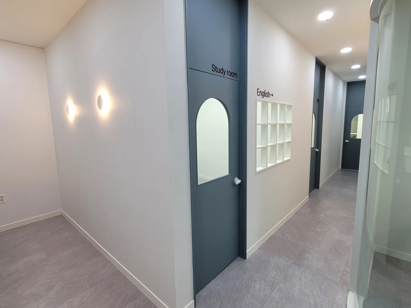
In the photographed corridor, blue-gray doors repeat between bright walls, with room names and white storage compartments also visible. Door locations stand out without darkening the entire corridor. Because the doors share a color, names and directional signs are still needed. Think of color as a background that helps guidance remain readable rather than a substitute for room names.
Accenting doors is an option when changing whole walls feels excessive. Matching leaves and frames looks different from changing leaves alone. Beside windows, decide whether frames follow the door color or remain as light as the wall. Dark doors with bright frames and storage, as here, distinguish the elements.
Different colors on every door can appear all at once in a corridor with many entrances. If color identifies rooms, apply the same rule to signs and names. Without a specific reason, repeating a door color and distinguishing rooms through lettering and numbers can simplify planning. Explaining each color's role matters more than the number of colors.
Entrance walls and inner corridor walls need not have equal emphasis. Branding can be concentrated at the entrance, with corridors retaining only classroom guidance. Mark candidate signs, logos, doors, and wall colors on the same drawing to identify competing accents. Draw where and how extensively colors will appear before collecting small color chips.
Books and notices add classroom color too
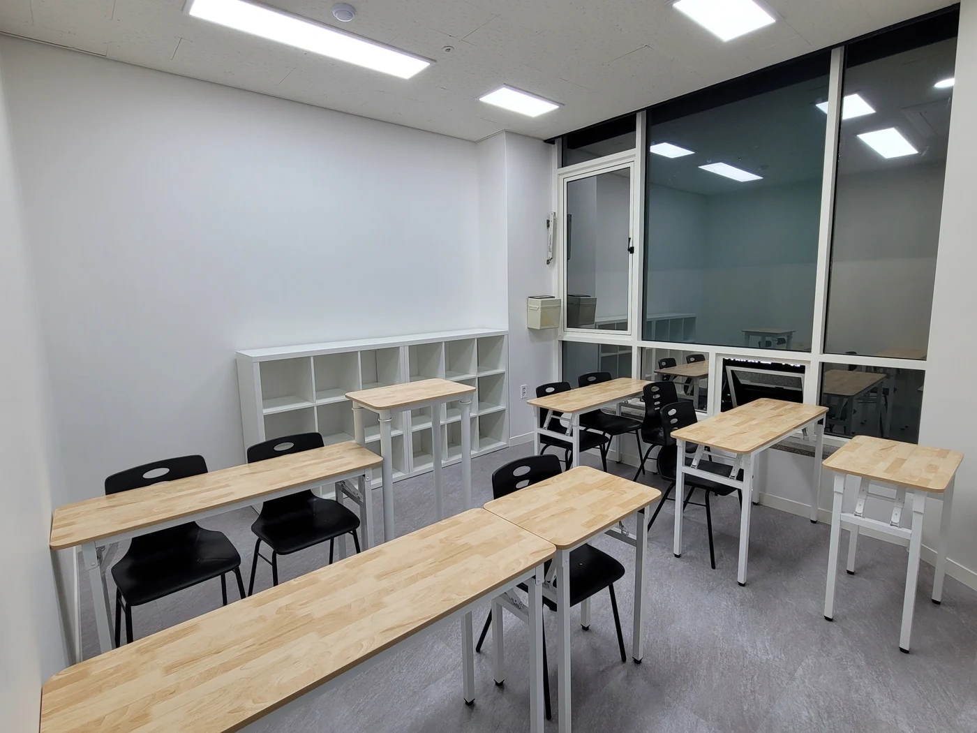
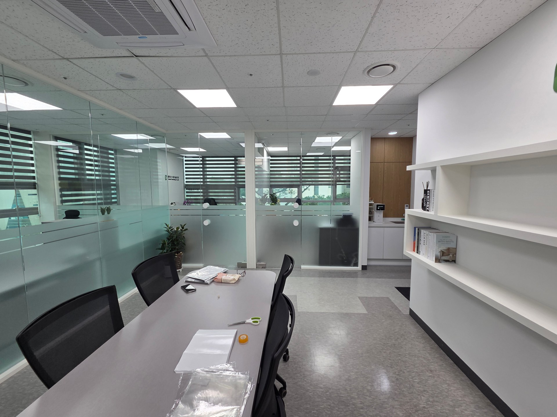
A classroom may look different empty at completion and in use, as shelves fill with books and notices and tools arrive. A blank wall in a completion photograph does not need to become entirely an accent color. Considering future displays and filled cabinets helps establish the background palette.
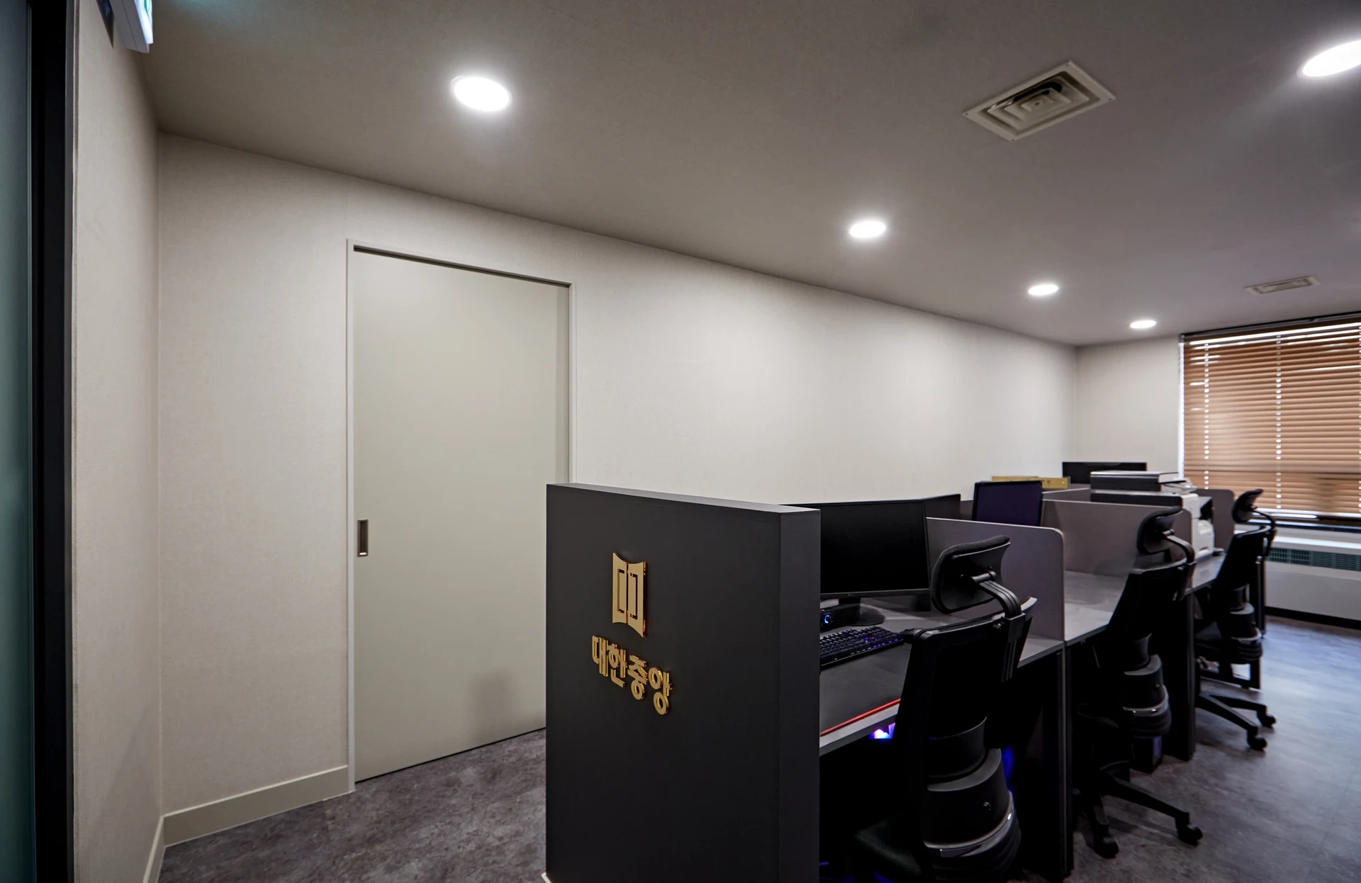
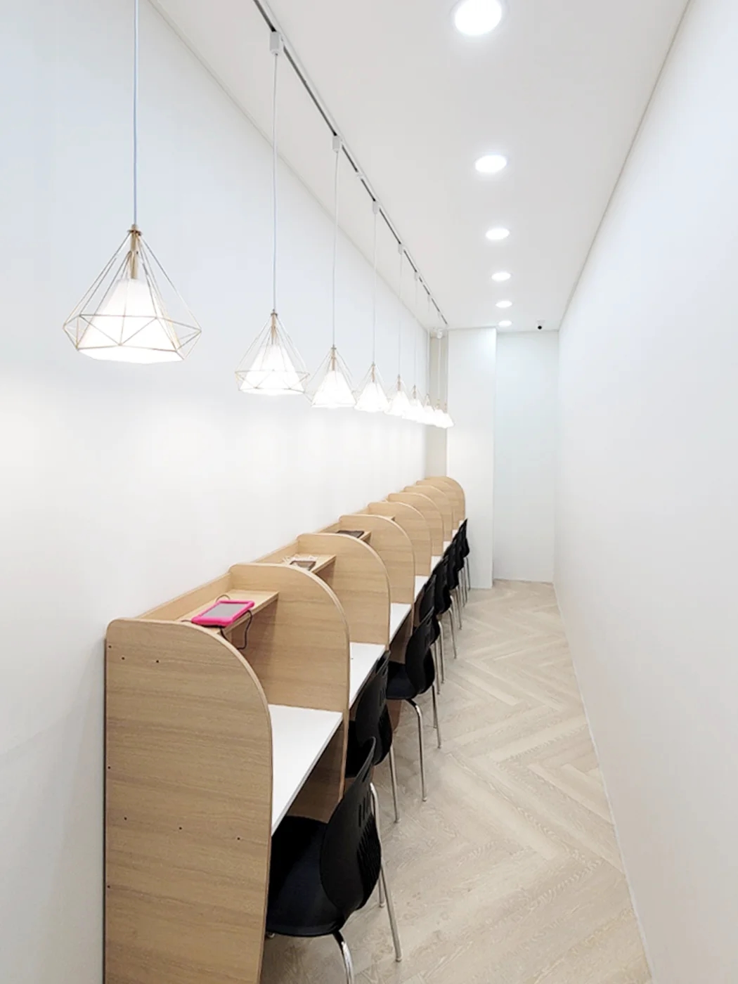
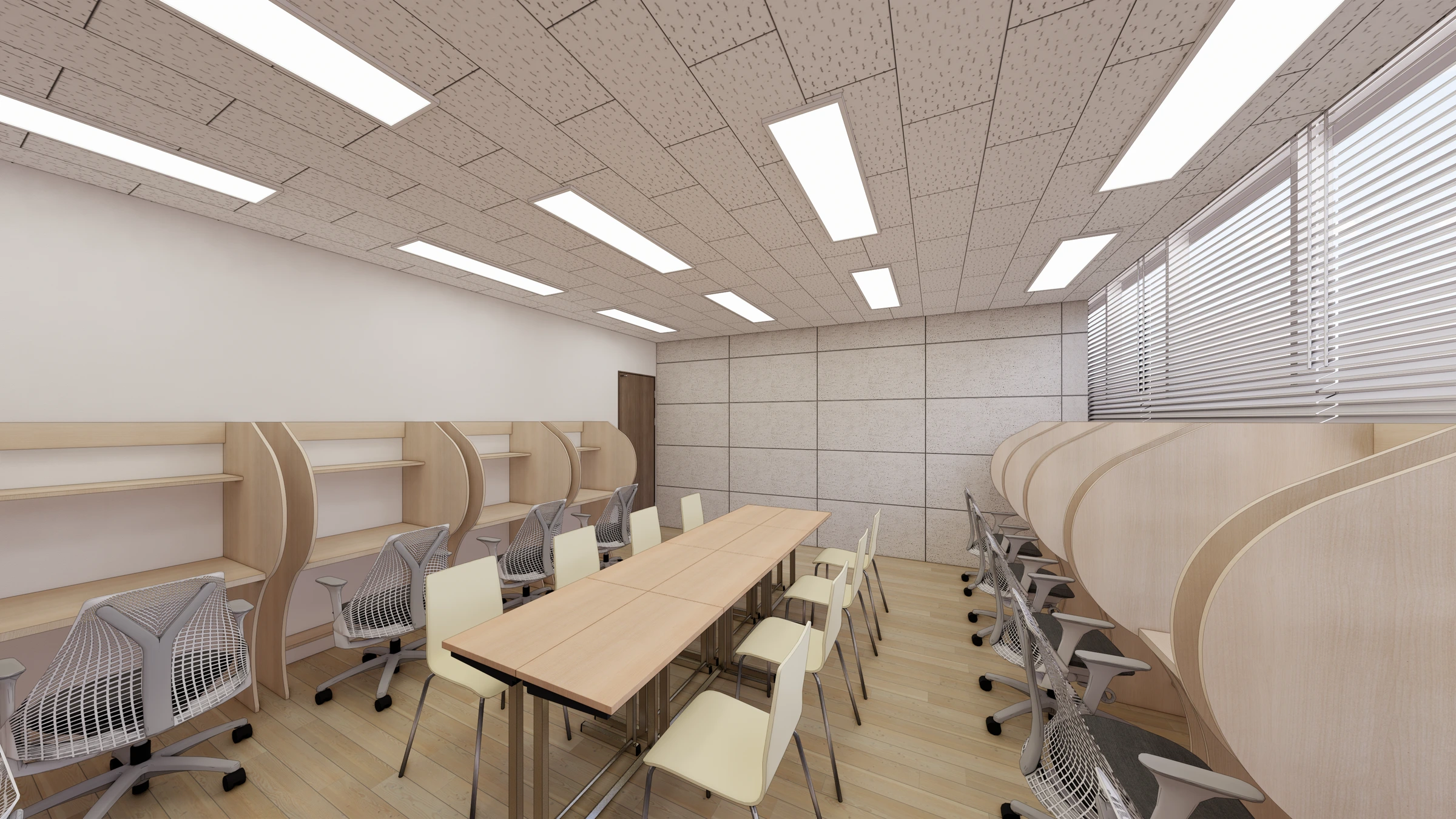
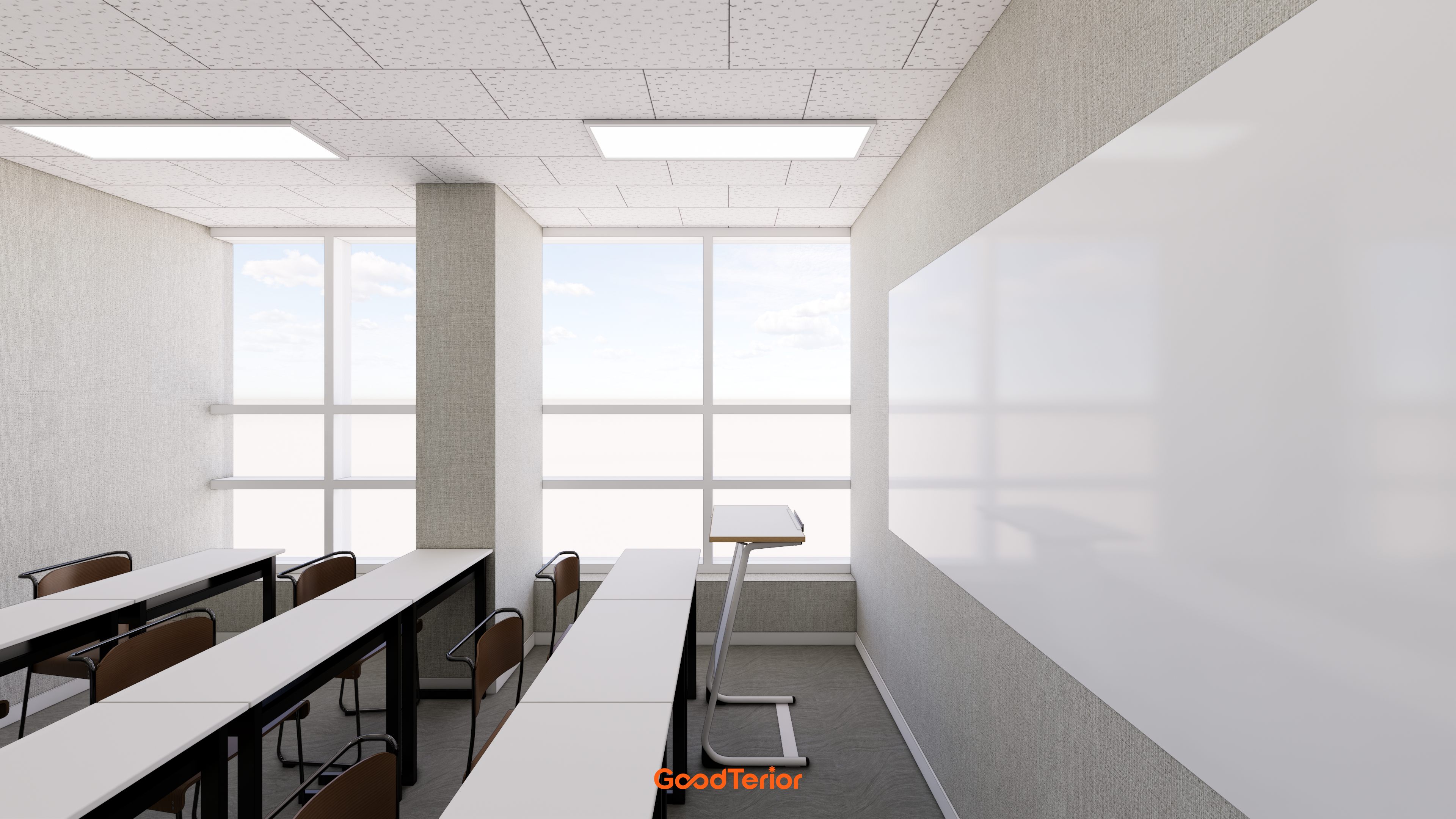
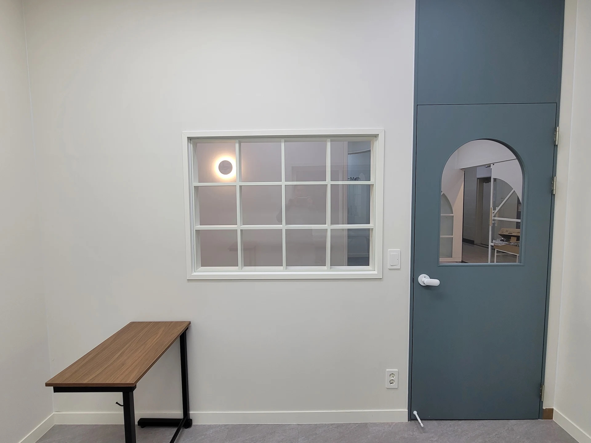
The photograph combines bright walls and low cabinets, timber-pattern desktops, black chairs, and gray flooring. Several colors and materials already share the room. Consider any added dark wall through the whole seated view rather than in isolation. Photographs show color relationships and layouts, but not actual product names or paint codes.
If retaining desks, obtain an actual desktop or sample first. Selecting wall colors before matching furniture may reveal unexpectedly yellow timber or cool gray later. The same applies when retaining floors. Separate retained and replaced items, then compare new colors beside existing materials to clarify the choices.
Matching cabinet and wall brightness can make them read continuously. That appearance changes when shelves fill with books. Decide which compartments expose books, which receive doors, and where student work goes. Adjusting how much content remains visible may matter more than adding another cabinet color.
For an accent wall, check whether it overlaps board or screen views or notice areas. Leaving a wall clear can be purposeful. This classroom palette is not necessarily suitable for every subject or age, and it does not establish that a particular color improves concentration. The useful principle is assessing actual textbooks, furniture, and guidance together.
Confirming whites and accents with real samples
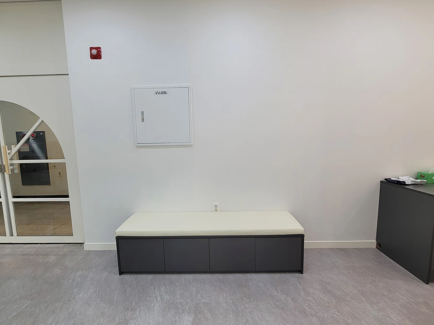
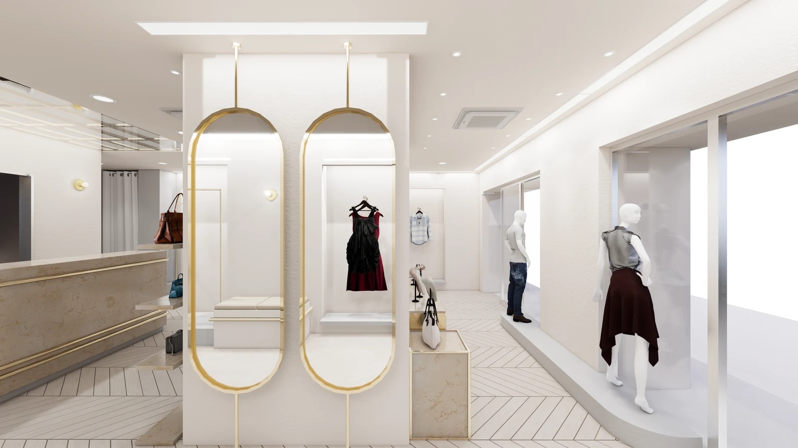
Even white walls have many sample options. The photographed wall, bench cushions, and skirting are all light but have different materials and surfaces. Compare actual wall finishes, furniture, and floor samples rather than copying the image color. Separating screen-based palette selection from final material approval makes decisions more reliable.
Samhwa Paint's pre-consultation guidance notes that web and photograph colors may differ from actual colors and that tinting can vary by paint type, recommending physical samples. This applies to choosing paint colors. It does not establish that the photographed academy used Samhwa products, nor whether its doors are painted or film-finished.
When walls and doors use different materials, do not assume the same color name gives identical results. Compare paint and film samples directly, considering narrow frames and broad walls separately. If accurate accent matching matters, record the product and color code. Supplying only a logo file's color value does not complete material selection.
View samples by windows, in inner classrooms, and in corridors, including under lighting used during lessons. Photographs include shooting conditions, so avoid treating a single image as the final color reference. Beyond color, confirm sheen, care at frequently touched surfaces, and compatibility with existing substrates using product documentation.
For partial renovations, quote door-only changes separately from wall changes. Define work around frames, handles, and wall junctions for meaningful comparison. Cost and time depend on substrate condition and scope, so fewer colors are not automatically cheaper. Record product names, codes, application locations, and retained samples to support later repairs.
Ask us about your interior project
We can discuss a quote and design suited to the space you are planning.
Request a free consultation