Office brand walls: how much of your logo and company story should you show?
Recognizing a company and reading its information in detail happen at different moments. Actual office photos illustrate where to place entrance signs, logo walls, and company information, and the order in which visitors read them.

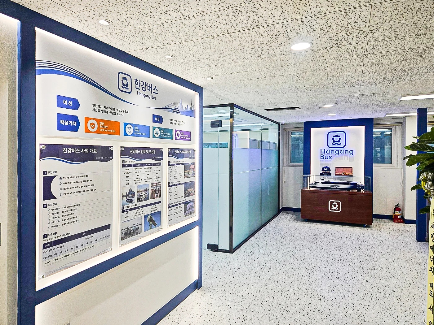
Before you begin
- Give the company name seen from the building corridor and the brand wall inside the office separate roles.
- Use logos and displays to identify the company from a distance, and place longer explanations on walls where visitors can stop to read.
- Before installation, walk through where visitors stand on entering and the route they take after being welcomed.
Let visitors identify the company from the building corridor
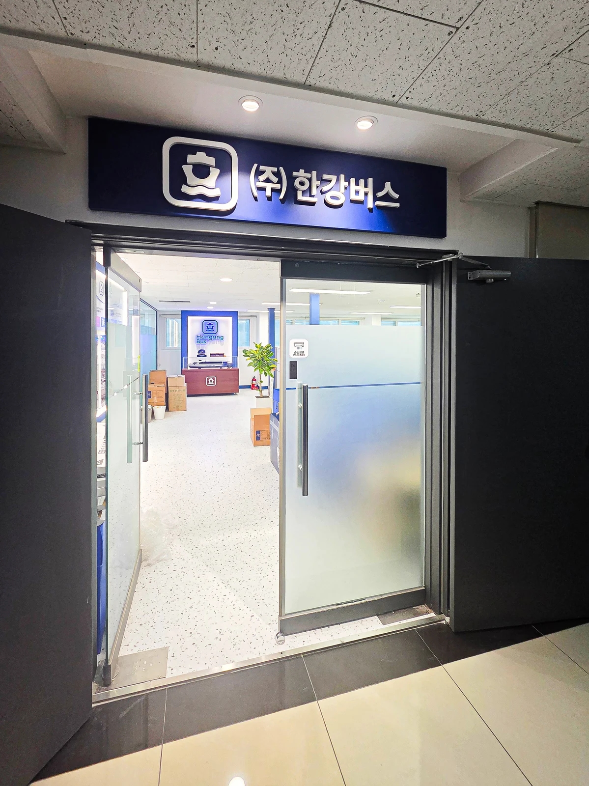
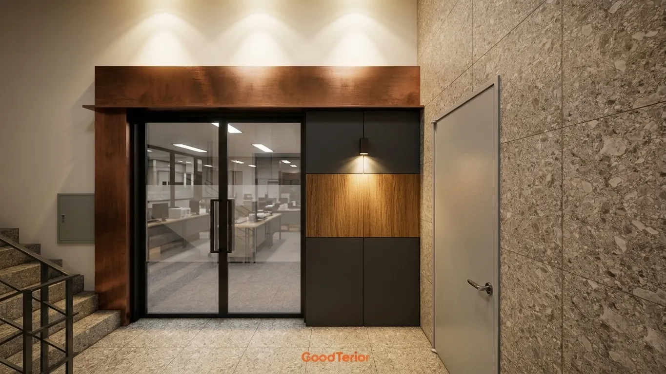
First-time visitors need to check that they have found the right door before reading about the company. In this office, the company name sits above the entrance, and an interior logo wall is visible through the glass door. Although the same logo appears twice, the roles differ: the outer sign identifies the entrance, while the inner wall creates a place to pause after entering.
When planning an office brand wall, first check whether the external sign can be seen from the building's common areas. Consider the direction people approach from the elevator or stairs, and whether the company name could be confused with signs for other floors. The permitted extent of common-area signage requires separate checks against building management rules and approval conditions. Finalizing size and location from an interior concept alone may lead to later changes.
Here, the sign above the door and the illuminated logo inside appear in a single view. That does not make the arrangement necessary for every office. If a receptionist or counter is immediately visible on entering, the interior logo may work better on a wall that does not compete with that position. If several routes branch off from the entrance, emphasizing the company name alone will not tell visitors where to go next. Draw entrance identification and internal guidance separately.
Budget decisions are also easier when these locations are not bundled into a single item. A name sign in the common corridor requires confirmation of management responsibilities and installation conditions, while an interior display wall affects wall finishes, power, and lighting. You might illuminate both, or use a legible sign outside and concentrate the visual treatment inside. Ask how sign fabrication, electrical work, wall finishes, installation, and maintenance are each covered in the estimate.
What should appear beside the logo?
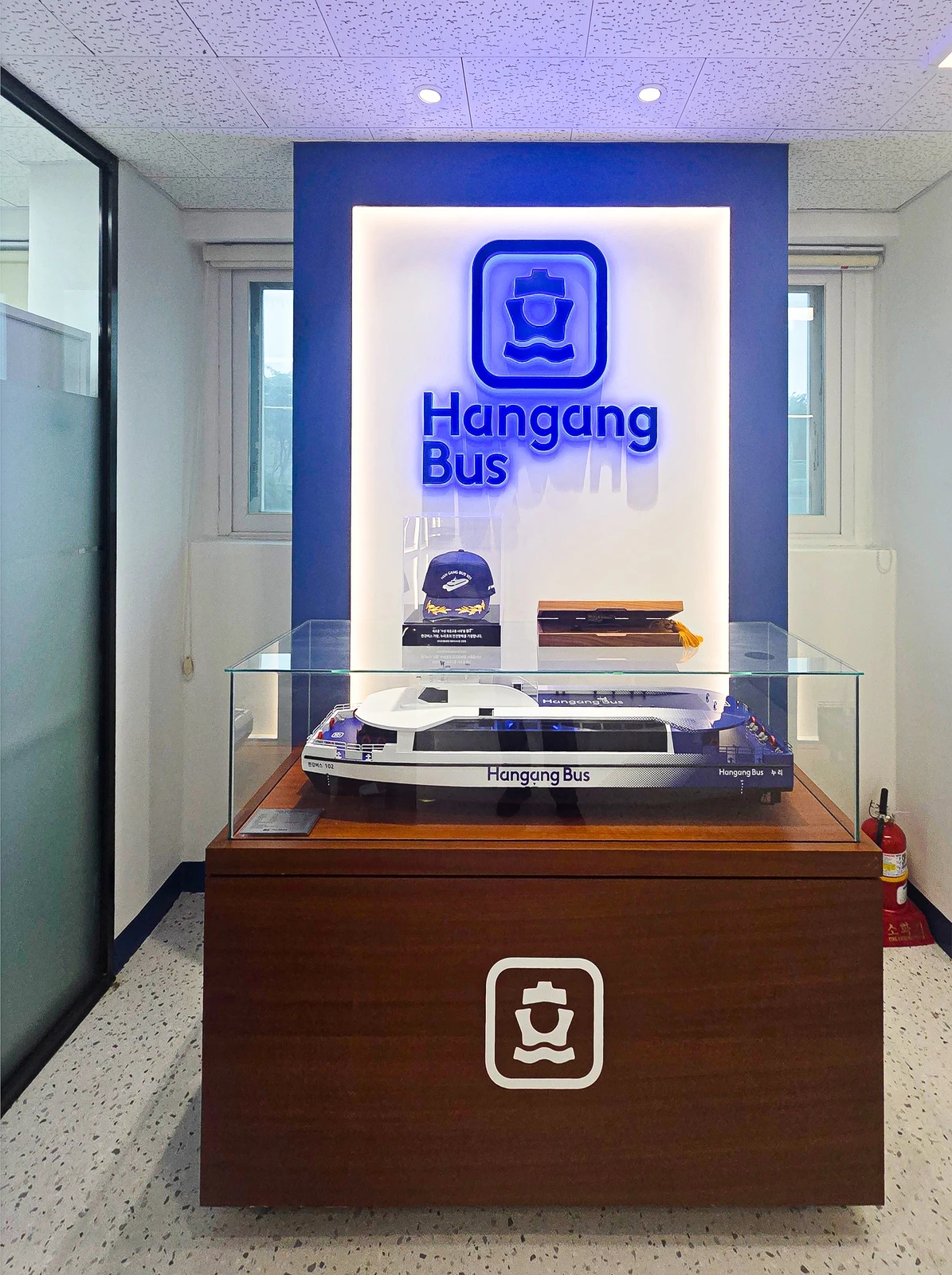
The interior wall combines an illuminated logo with a model ship. The company name and the subject of its business can be understood together without reading a long explanation. The model is displayed in a glass case, but the photo cannot tell us how long visitors actually stay there. The key is to choose visual clues to what the company does instead of simply enlarging its logo.
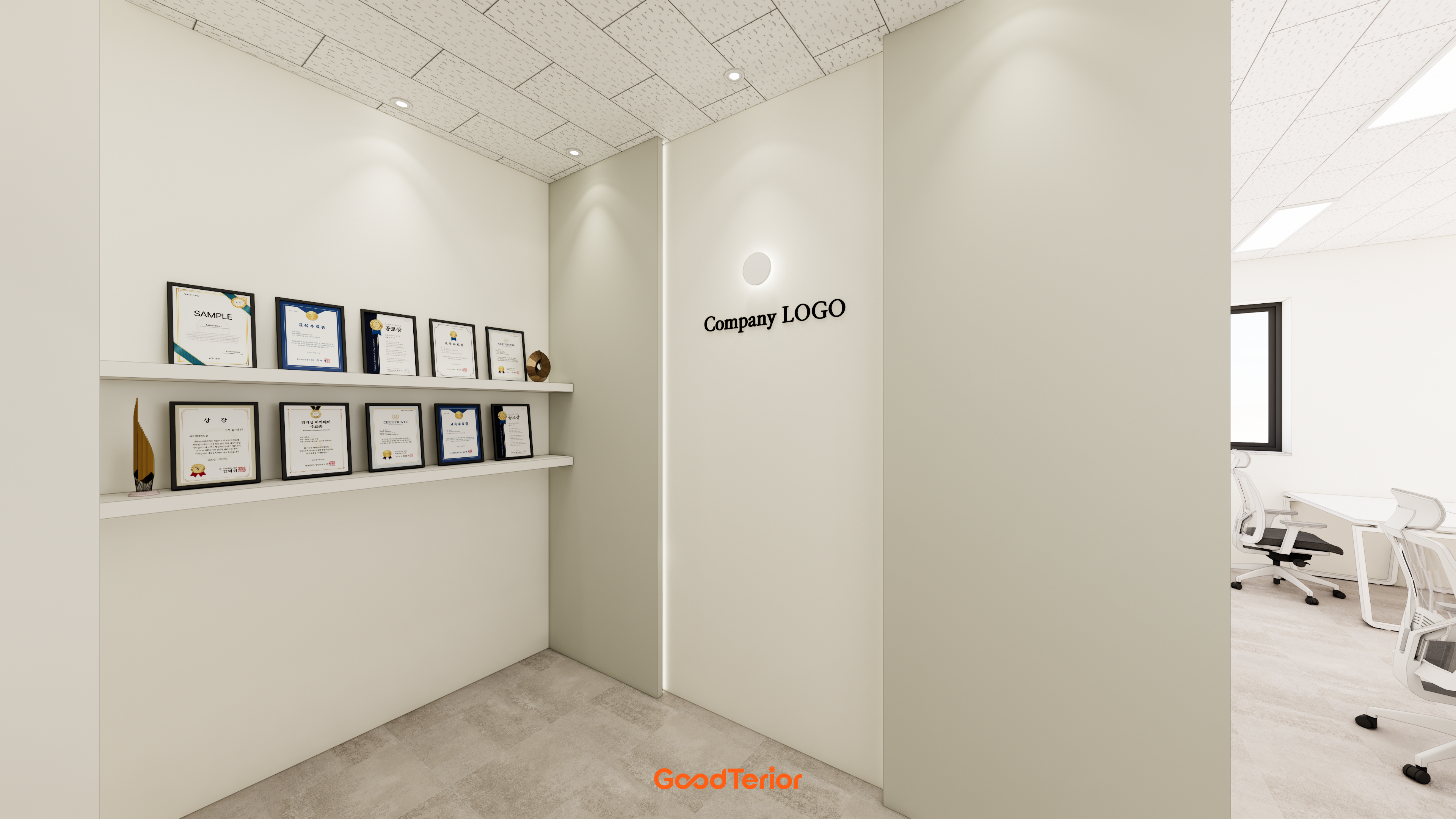
An office without products to display need not fill the space with ornaments. A photo of a finished product, an image showing where a service is used, or a short sentence may communicate more accurately. Distinguish information recognizable from a visitor's standing distance from details that require a closer look to avoid a cluttered wall. For visitors unfamiliar with the industry, the company name together with what it does is easier to understand than a large acronym alone.
When adding lighting, consider not only the visibility of the logo's shape but also reflections in the case glass, power locations, and how exhibits will be replaced. With windows on both sides as shown here, reflections may change throughout the day. Actual brightness and reflections require site checks. Also check the drawings for concealed sockets blocking access panels or chairs in front of the display making it difficult to approach.
A wall carrying only a name and a wall incorporating a display case involve different work. Simple lettering may be attached to a finished wall, whereas recessed lighting and display shelves require coordinated wall depth, wiring, and shelf loads. If the exhibits' dimensions and weight are undecided, first record their width, height, and replacement frequency. This helps avoid overbuilding the shelf or case, or dismantling it after completion.
Put detailed company information where visitors can stop to read
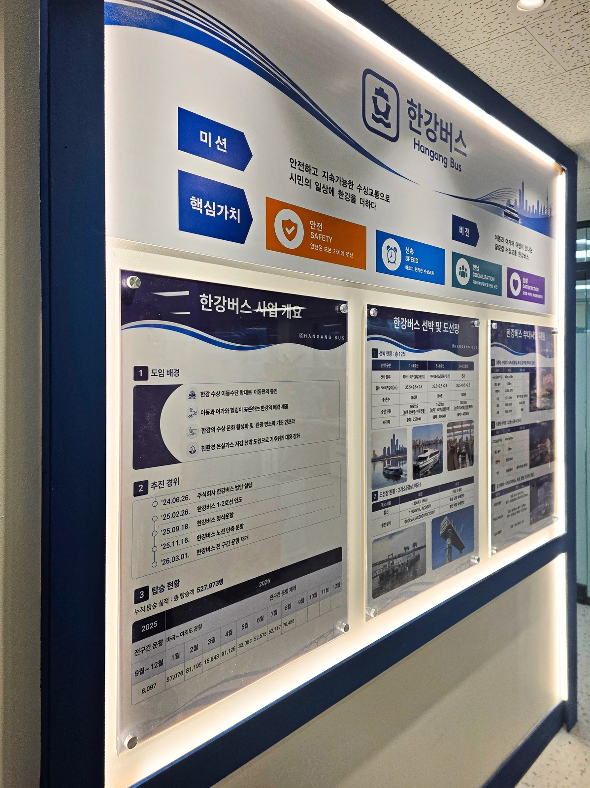
The opposite corridor wall carries panels explaining the company's mission, core values, and business. Blue divisions and large headings are visible from a distance, while the details require standing closer. Since these take longer to read than an entrance identification sign, the text is not all gathered on the same surface. Figures and schedules visible in the panels reflect the time of photography and are not evidence of current performance.
Before creating company information panels, distinguish what visitors need to know. The company name and industry should be immediately apparent from several steps away, while business scope and processes can be read after an introduction. Information used during contracts or consultations may belong on a wall readily accessible from waiting seats or meeting rooms. For a passing corridor, the sequence of headings and images matters more than a long table. Remove information with no clear audience or moment of use before printing.
Plan how information will be replaced as operations change. The photographed display is divided into individual panels, but its actual mounting method is unconfirmed. Separate panels make it easier to consider changing selected content; a single large graphic reduces joints but may require a larger replacement when edited. In either case, draw the wall finish, lighting, and fixing positions together so the printed material does not later cover building services.
Finally, mount paper mockups at the intended size and follow the visitor's sequence: identify the company from the corridor, open the door, receive directions, see the logo, and stop at the information panels if needed. This office is one example, and the order will differ elsewhere. Without a reception desk, or where visitors go directly to a meeting room, move the reading points to suit that route.
Information panels with many words and figures are easy to treat as finished once their initial wording is approved. Assign someone to identify frequently changing content and decide when updates should happen. Stable company information can become a wall graphic, while changing schedules can use replaceable panels or other notices. Establishing these operating arrangements first helps prevent outdated information remaining on an attractive wall.
Ask us about your interior project
We can discuss a quote and design suited to the space you are planning.
Request a free consultation