Bakery Cafe Interiors: 3 Display and Order Counter Layouts
How should bread selection connect to ordering drinks? Compare a separate display, a counter-side showcase and a central counter in Gasan 27-pyeong, Magok 14-pyeong and 80-pyeong bakery cafe designs.

Before you begin
- Separate self-selection from products retrieved by staff.
- Overlay ordering, collection and seated customers on one plan.
- Align display furniture, showcases, equipment and services as separate scopes.
Gasan 27 pyeong: separate bread display and long order counter
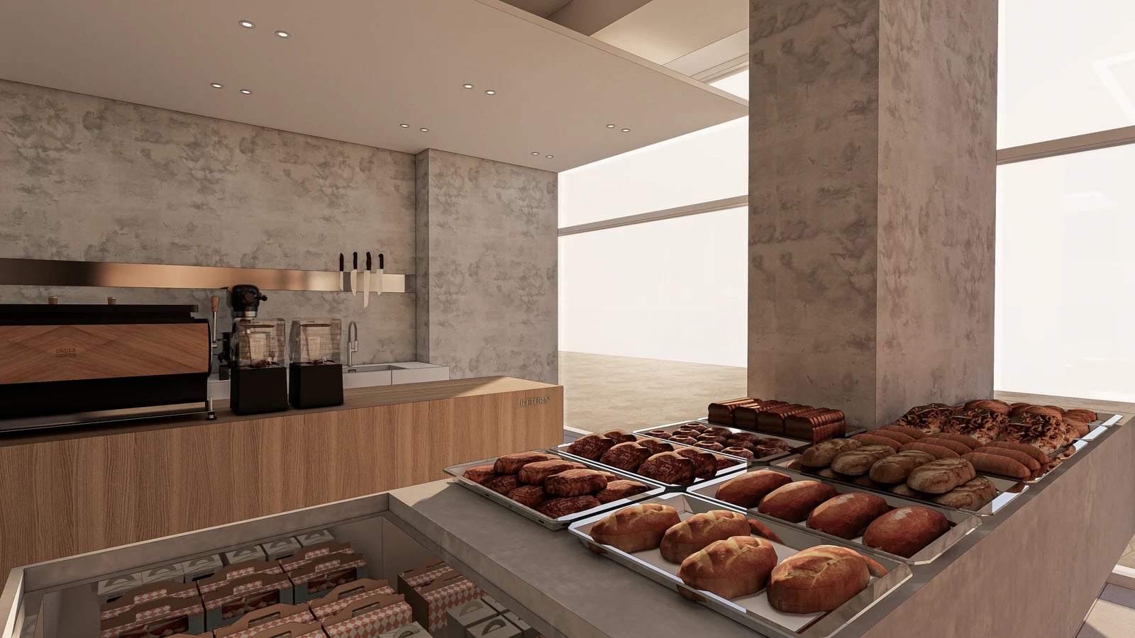
Bakery cafe interiors need to connect choosing bread with ordering. The published construction area of the Goodterior Gasan 27-pyeong bakery cafe design is 89.65 square metres, or 27.12 pyeong. The planning drawing separates bakery display furniture from the long POS counter. The render likewise places bread trays in front of a timber counter holding drink equipment.
Compare this arrangement with customers browsing several products, filling a tray and then paying. Separate display faces can keep selection from stopping directly at the order point. Independent furniture also needs standing space around it. Mark where someone pauses with a tray and where another person passes, rather than measuring the furniture footprint alone.
The lower glazed display and the bread trays above present different ways of reaching products. Decide what customers select and what staff retrieve before comparing handles, opening faces and packaging surfaces. A populated render does not establish refrigeration or storage conditions. Distinguish furniture from equipment through the actual menu and selected equipment specifications.
The same drawing includes hall tables, the long order counter and the rear worktop. Examine whether replenishing trays requires staff to cross customers who are paying and where empty trays return. Adding display furniture changes seating, circulation or replenishment space. A larger display is a decision about both merchandising and hall operation.
Magok 14 pyeong: a small showcase at one side of the counter
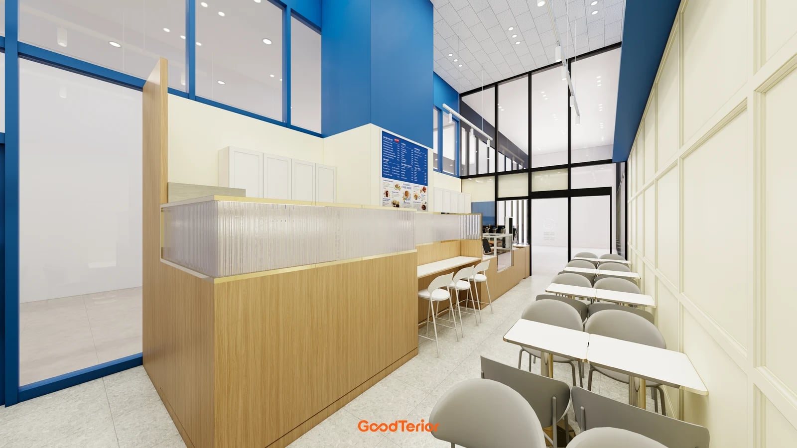
The Goodterior Magok 14-pyeong bakery cafe design records 46.28 square metres, or 14 pyeong. Counter and wall tables run alongside the long narrow hall. The selected view includes the glass showcase at one end, the menu and the opposite tables. Screened counter sections differ from those open to customers.
A shop with several rows of bread for self-selection needs different display faces from one where customers order desserts through staff. Magok offers a comparison for ordering around the counter. Avoiding a separate display can bring selection and payment closer together. Decide where the next customer waits while someone chooses, so the queue does not take over the space beside seated customers.
Stools follow the counter while chairs occupy the wall side. Compare someone pulling out a chair and leaving with another person passing to order. If the range expands, compare a larger showcase with changes to the menu or replenishment frequency. Keep a usable order surface when considering additional display equipment.
The translucent screen divides what is visible of the working area. Concealing equipment, showing menus and exchanging items have different roles. Review actual equipment and reach positions before choosing screen height for appearance alone. Check that ordering and collection remain possible while the showcase opens and products are retrieved.
80-pyeong design: a central counter and surrounding seating
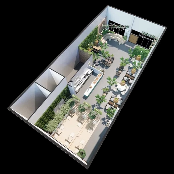
Compare the Goodterior 80-pyeong bakery cafe design through its overall layout render. A long counter occupies the inner hall, with several seating areas around it. The public plan also identifies the kitchen behind the counter and its relationship to the hall. This is not simply an enlarged version of the Gasan display or Magok order face.
With seating in several directions, first decide which counter face serves collection. Examine whether customers waiting after payment block routes towards tables. Table service and customer collection can draw people to different faces of the same counter. More floor area alone does not separate ordering and collection.
The overall image helps explain hall connections beyond a single display face. Draw separate routes for passing customers, staff replenishing trays and staff clearing seating. Include actual plan sizes for plants and freestanding chairs when examining turning space. The furniture and planting are a design arrangement, not evidence of congestion measured during operation.
A central counter requires consideration of sides and staff entry as well as its customer-facing front. Connect a temporary landing surface for products from the kitchen, packaging storage and empty-tray return. If these are missing, compare reducing display space or reserving part of the counter for work. Exterior size and usable staff work area need separate comparisons.
Align menus and equipment before ordering display furniture
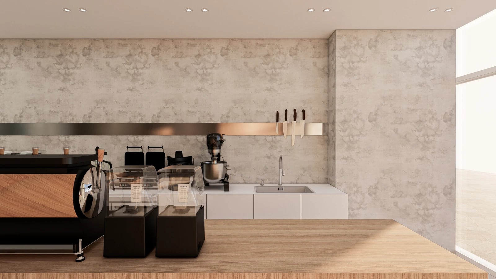
The last image shows Gasan equipment and the rear sink at closer range. A separate bread display still requires surfaces for drink preparation, packaging and tray handling. The three cases offer an independent display, a counter-side showcase and a central counter as comparison types. All images are design renders, rather than completion photographs or operating results.
Before ordering, list products and connect customer selection, staff retrieval, payment, packaging and drink collection. Furniture drawings should mark tray removal and door-opening directions as well as display compartments. Provide temporary landing space for replenishment and a place for used tools. Compare empty surfaces with fully equipped ones to identify missing working space.
Request separate scopes for fabricated display furniture, a purchased showcase, counter surfaces and storage, equipment connections and reinstatement. Counters of the same length can involve different screens, opening components and equipment cut-outs. Confirm retained equipment models and check manufacturer connection requirements against actual services. When replacing seats with display space, assess the resulting hall use alongside furniture prices.
Once the plan is assembled, review movement using the actual tray and packaging sizes and selected equipment. Check whether payment and collection can continue while bread is selected, and whether staff can return to preparation after replenishment. Use that sequence to choose separation as in Gasan, concentration as in Magok, or several faces around a central counter. Display appearance and the ordering sequence should be decided together.
Ask us about your interior project
We can discuss a quote and design suited to the space you are planning.
Request a free consultation