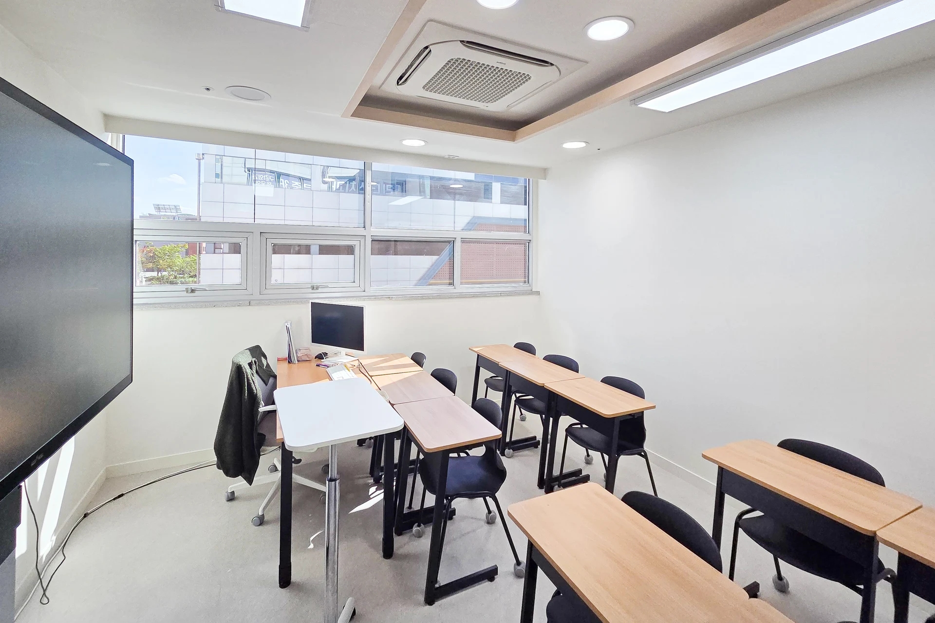
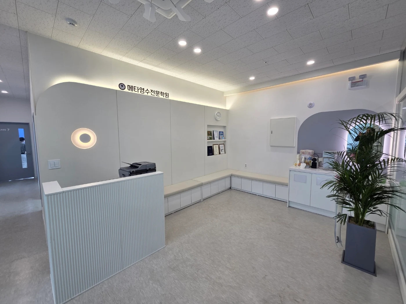
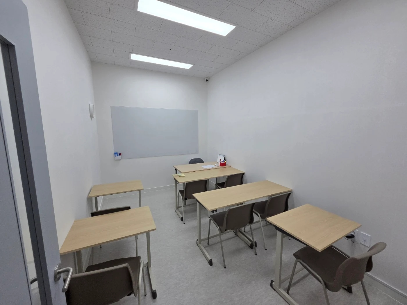
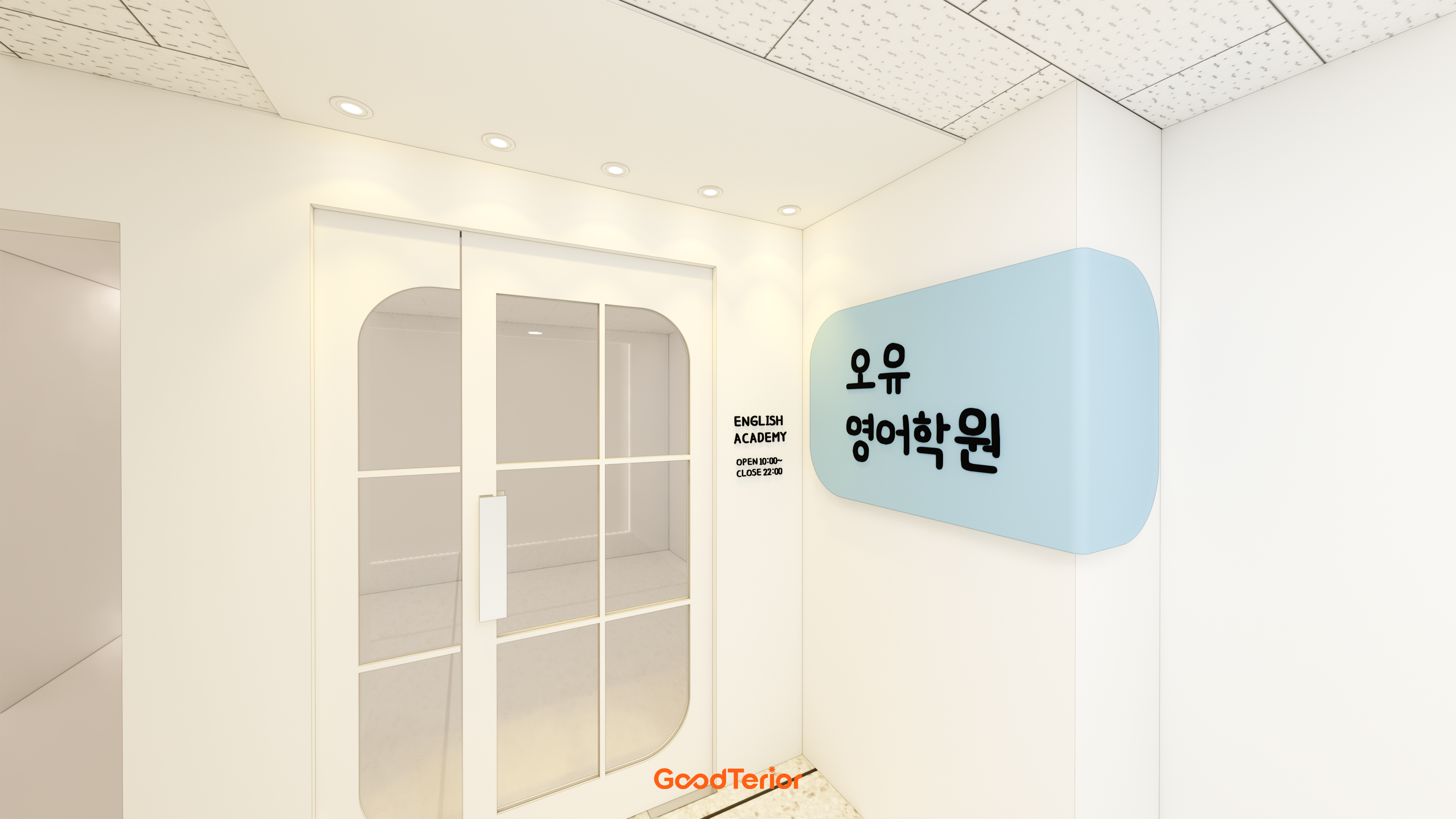
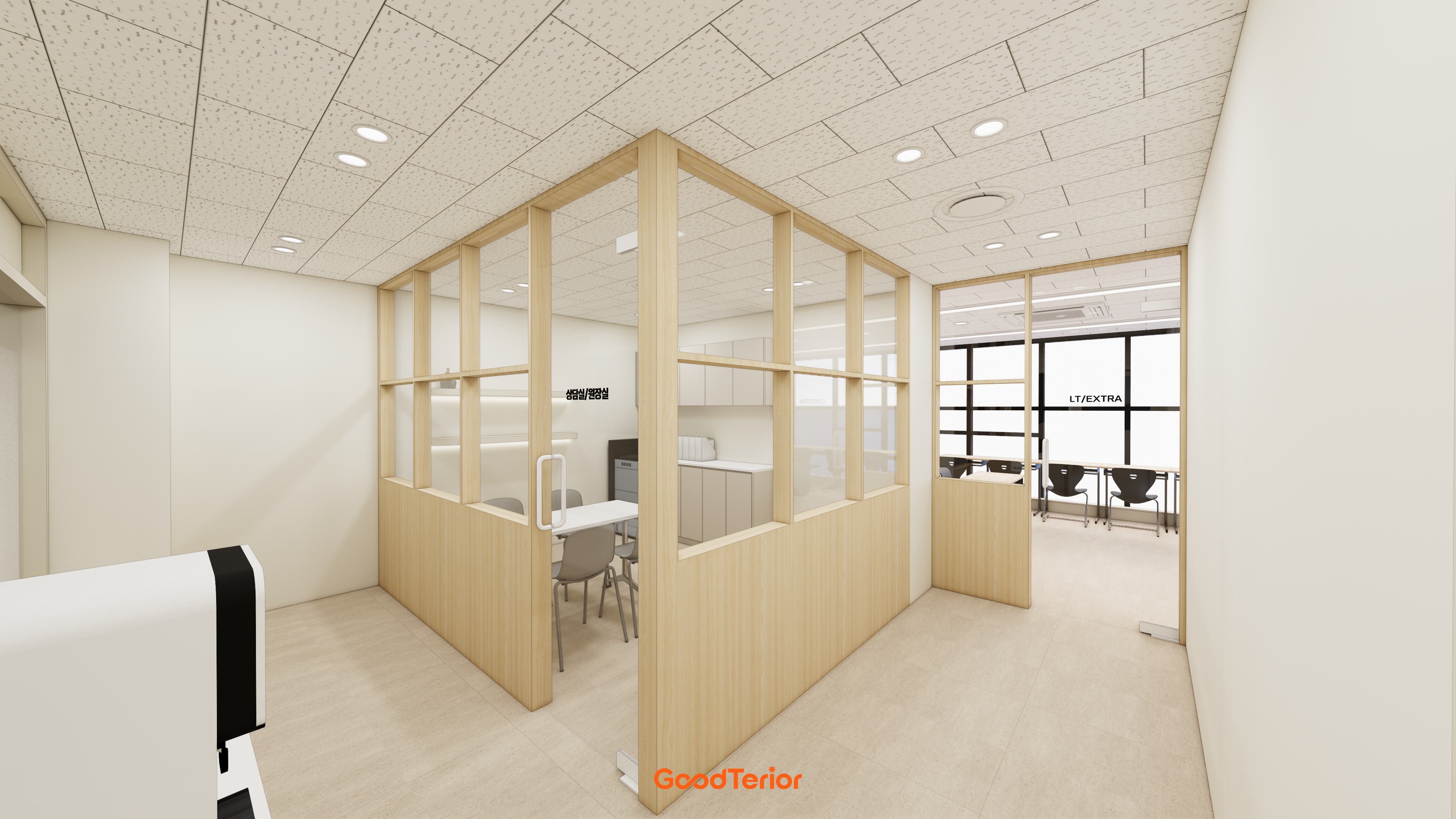
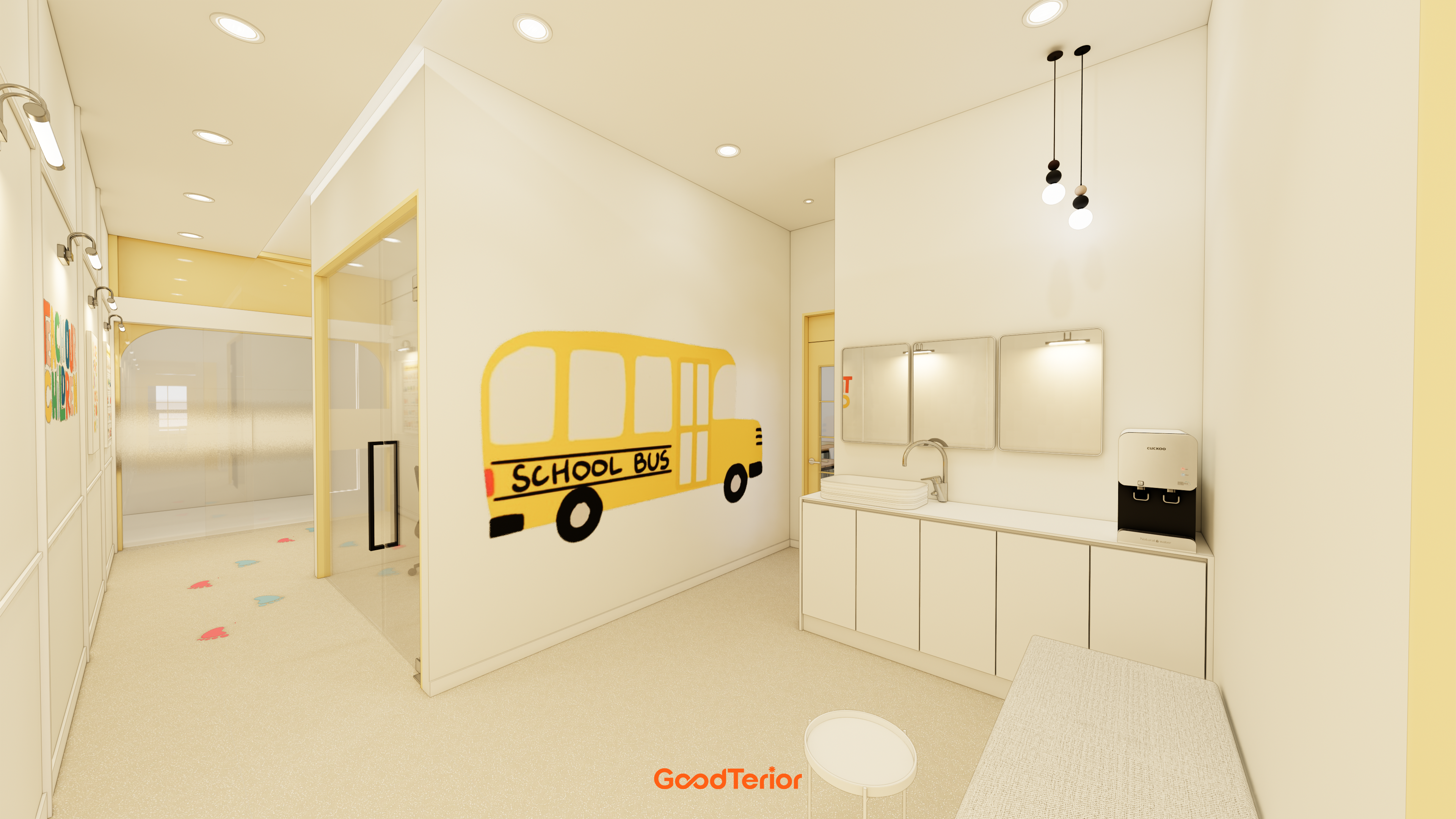
Academy corridors: wayfinding that makes classrooms easy to find
Corridor interiors combine decoration with classroom guidance. Organize names, colors, and sign positions so new students know their destination before reaching the door.

Before you begin
- Show destinations before people reach a junction.
- Use the same classroom names on signs and in daily operations.
- Prioritize information so decoration and guidance do not compete.
Classroom directions visible at junctions
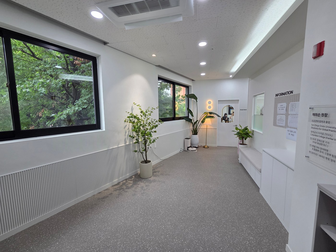
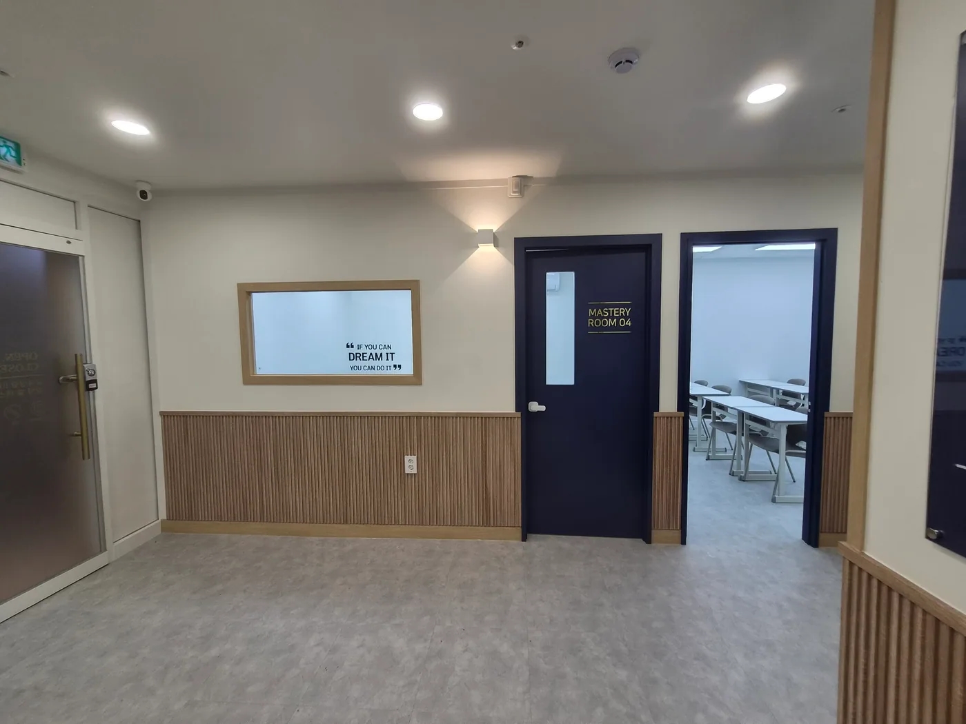
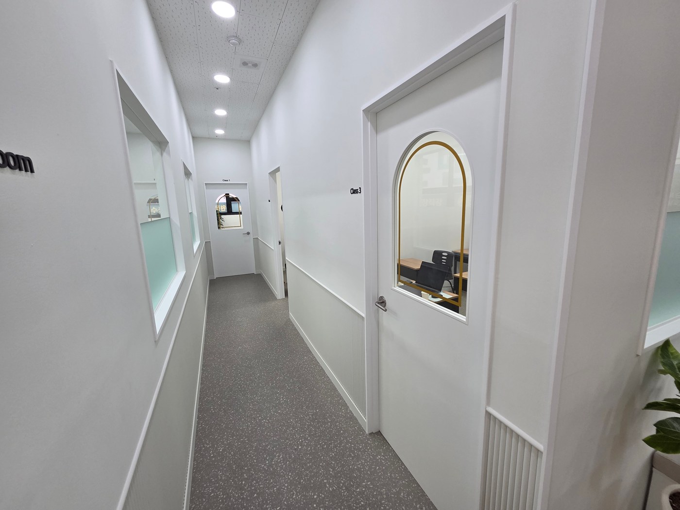
Position corridor signs where visitors decide which way to go, rather than wherever a wall happens to be empty. If the route branches or turns a corner, the destination should be clear beforehand. Names only at classroom doors can make visitors walk to the end and backtrack.
Walk from the entrance to the classroom as a first-time visitor. Check whether bookcases, open doors, or waiting people obscure lettering. Standing visitors and users with lower eye levels may see different areas, so testing legibility with actual users is helpful.
A consistent system for classroom names and numbers
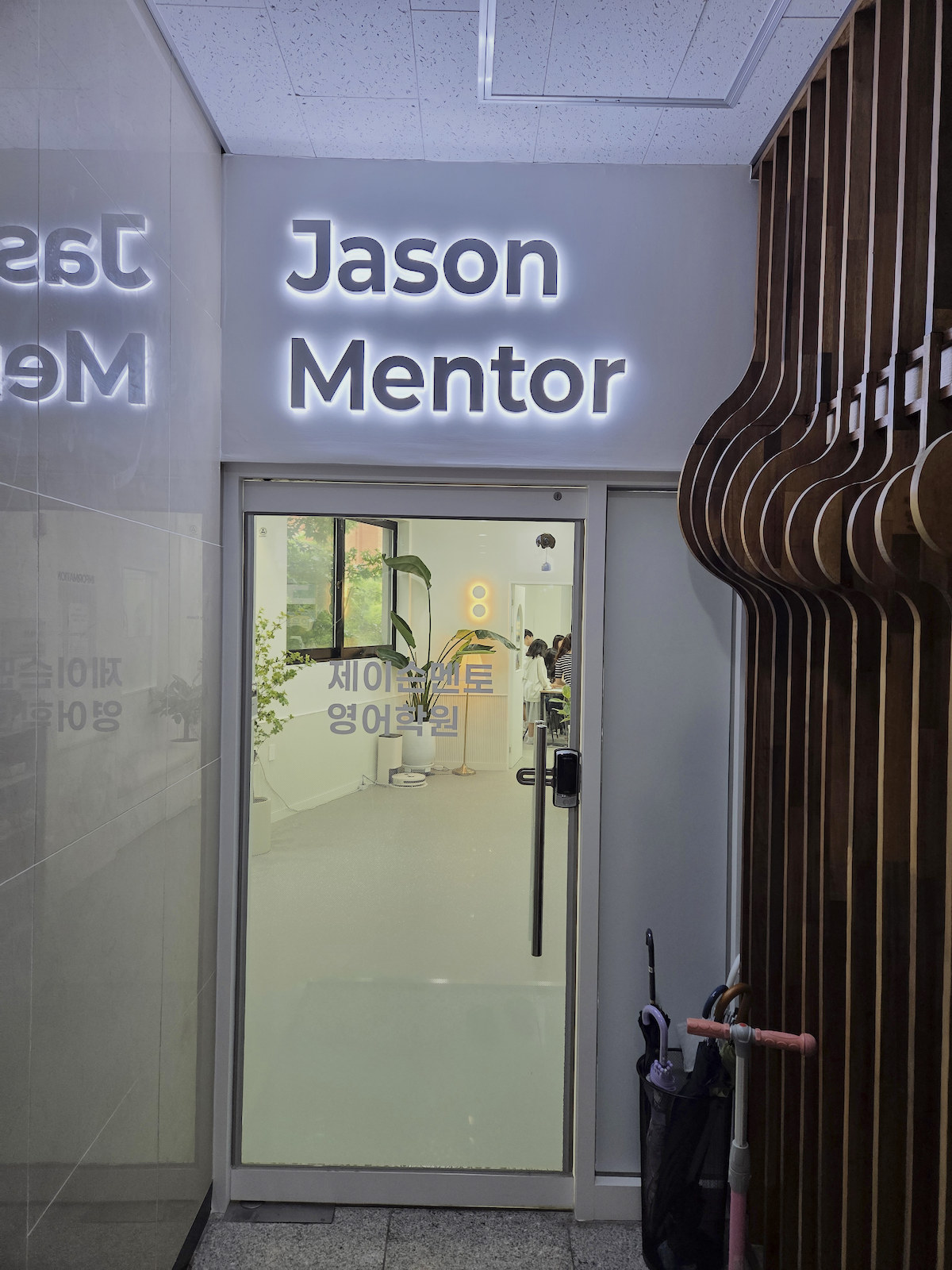
Different naming methods at every door make the system hard to understand. Align timetable names, staff's spoken directions, and door labels. Even when using both numbers and names, a consistent reading order makes future changes easier to manage.
If class names change frequently, separate permanent room names from lesson information. Fixed room numbers or names can stay on doors, with timetables on replaceable panels. Permanently attaching every message can lead to layers of added paper as operations change, making guidance confusing.
Lettering and backgrounds readable from a distance

Distinctive surfaces such as yellow doors or dark walls can identify destinations. Color alone can become confusing when similar shades repeat. Add names and numbers, and check the light-dark contrast between lettering and background on actual printed samples.
Lettering that looks clear on screen may merge with scenery behind glass. Check reflected lighting and shadows on signs. Read samples at the intended height and distance rather than viewing them on a desk. The test is whether necessary information stands out before bright decoration.
Circulation after noticeboards and shoe cabinets arrive
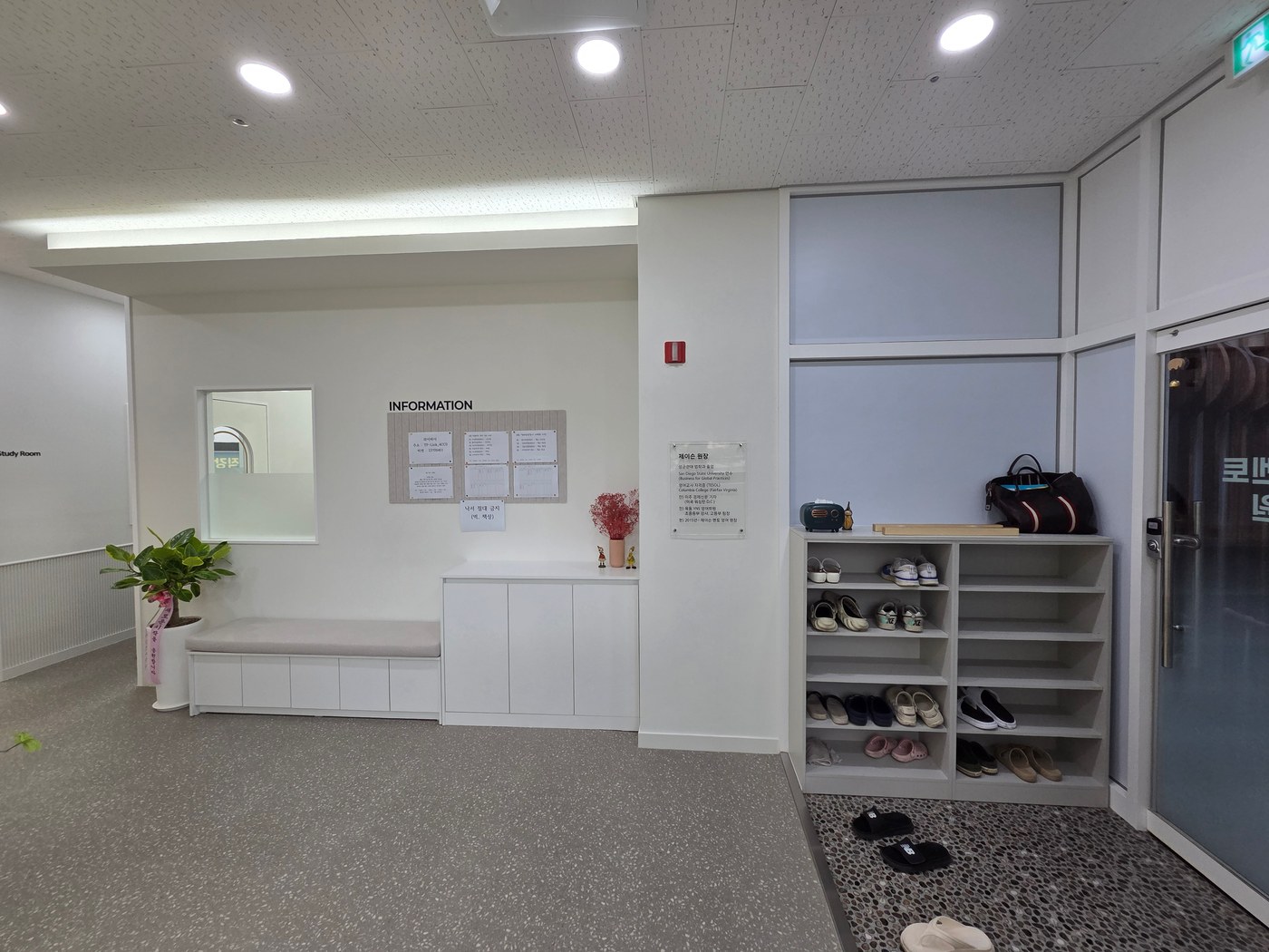
Walls clean at completion soon fill with timetables, notices, and student work. Defined posting areas keep classroom names from disappearing among announcements. Separate frequently changing information from lasting signs, and assign responsibility for removing outdated notices.
Check the effects of corridor storage and waiting furniture on doors, circulation, and evacuation during design. Decoration must not reduce necessary routes. For the final check, have visitors find destinations from signs without staff explanations.
What to check at this stage
- Can users identify directions before a junction?
- Do timetable names match door labels?
- Do reflections or posted materials obscure lettering?
Ask us about your interior project
We can discuss a quote and design suited to the space you are planning.
Request a free consultation